Internet Brands
Business Formation Microsite & Will Making ProductBusiness Formation Microsite
Hypothesis: Providing users who want to form a business a place where they can find educational information on a certain entity. This will allow the user to feel confident when moving onto the next phase of their business formation process.
- User: Starting Business (LLC, Corporation, Nonprofit)
- March, 2020
- Team: Product Manager, Developer, Marketing Team, UI/UX Designer(me)
- Tools
- Research: Google Calendar and Usertesting.com
- Ideation: Erasable pen and notepad
- Wireframing and Prototyping: Sketch
- Visual Design: Adobe Illustrator and Photoshop
- Duration
- 2 months (due to priorties within the business)
Problem
1. How might we
have the user become more fluent in your knowledge of forming their business?
2. How might we
accelerate the emotional identification process?
3. How might we
understand the business formation decision making?
4. How might we
gather information and effectively test this product?
4. How might we
better understand the pain points of the user?
4. How might we
empathize with the user?
Solution
Design a microsite that will provide a modern, stress free and educational experience when learning about forming a business. We're designing for all devices (desktop, tablet, mobile). While collaborating with the client, testers, developer, and Project Manager, we were able to create a sustainable product through constant iterations and testing.
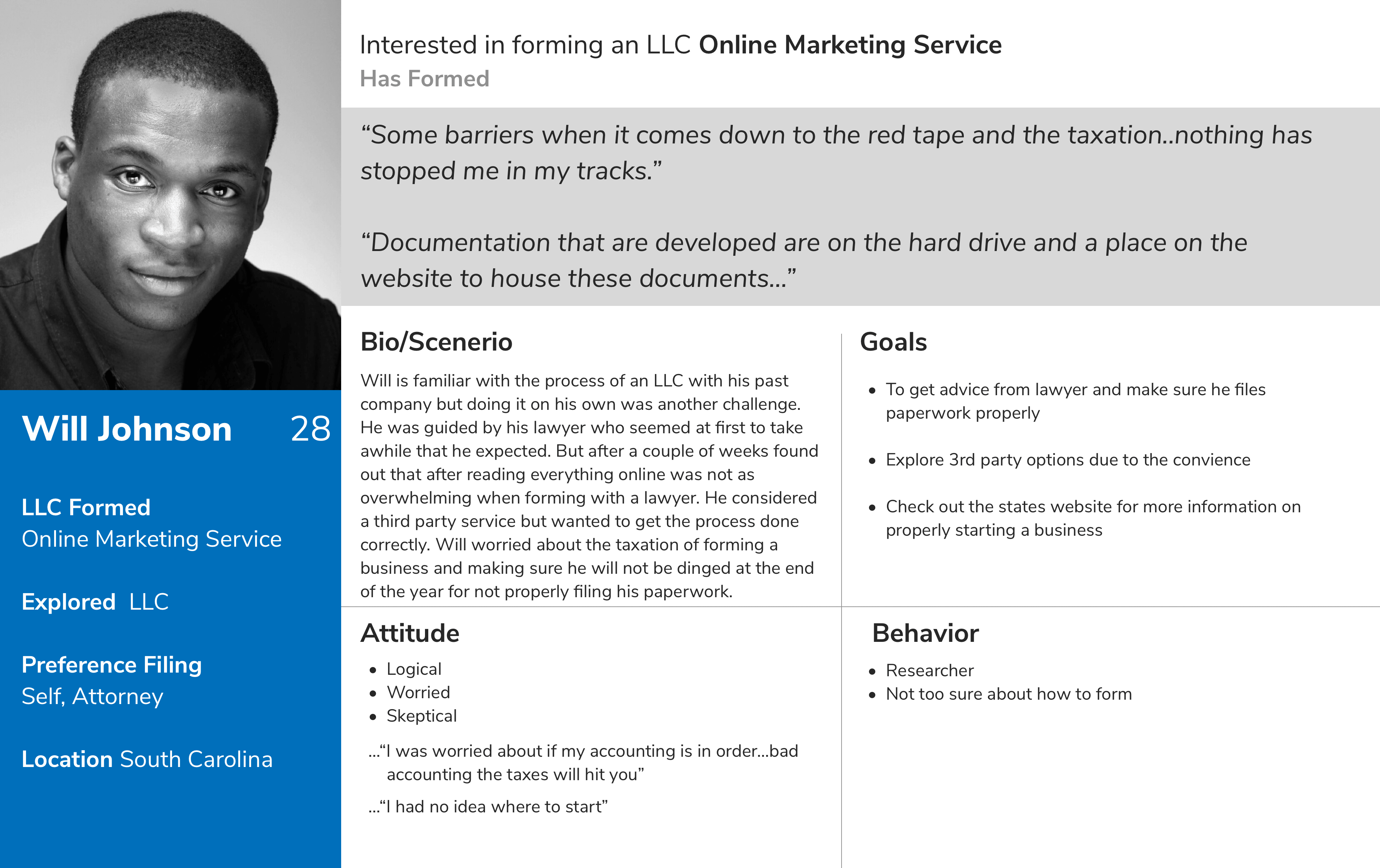
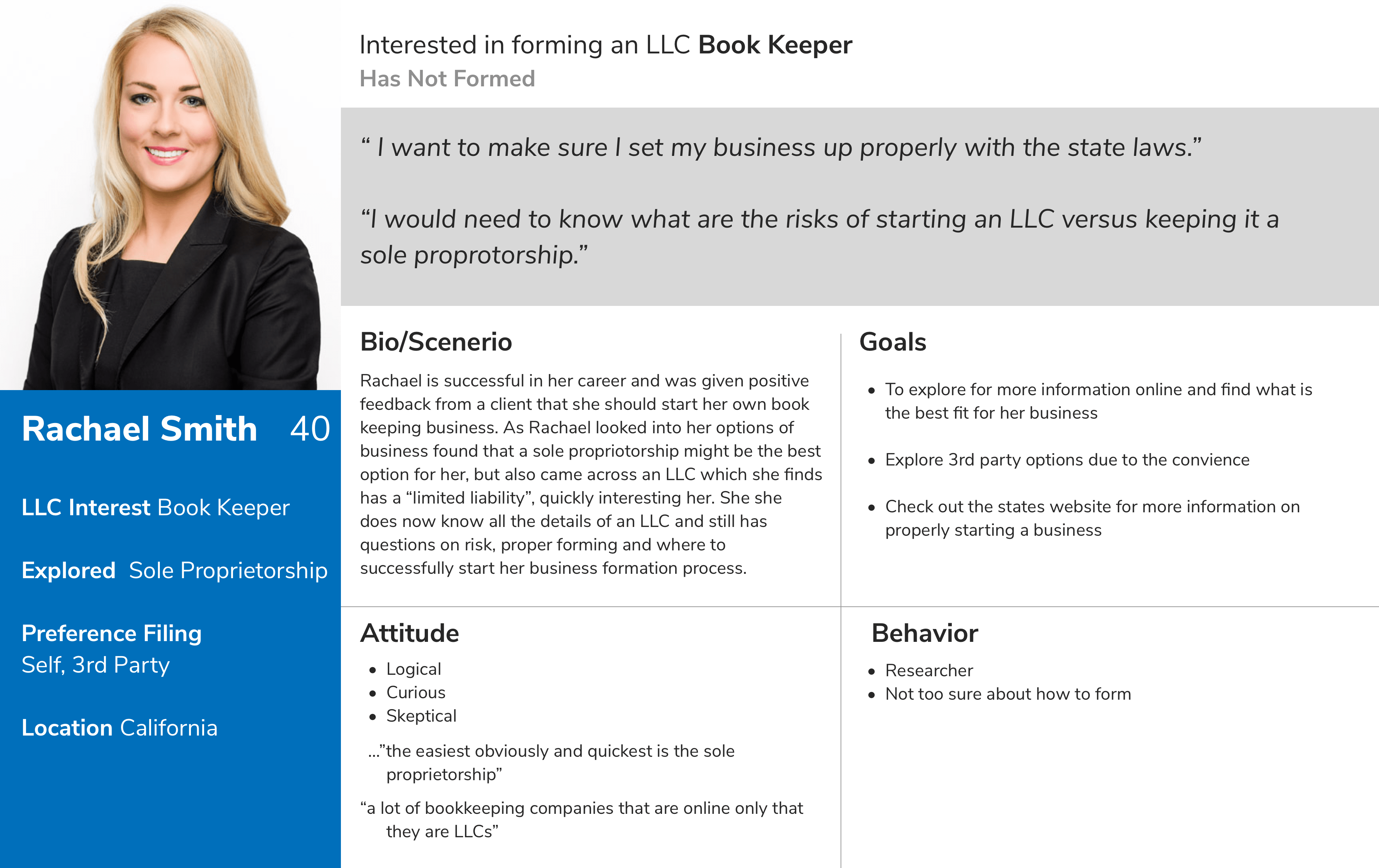
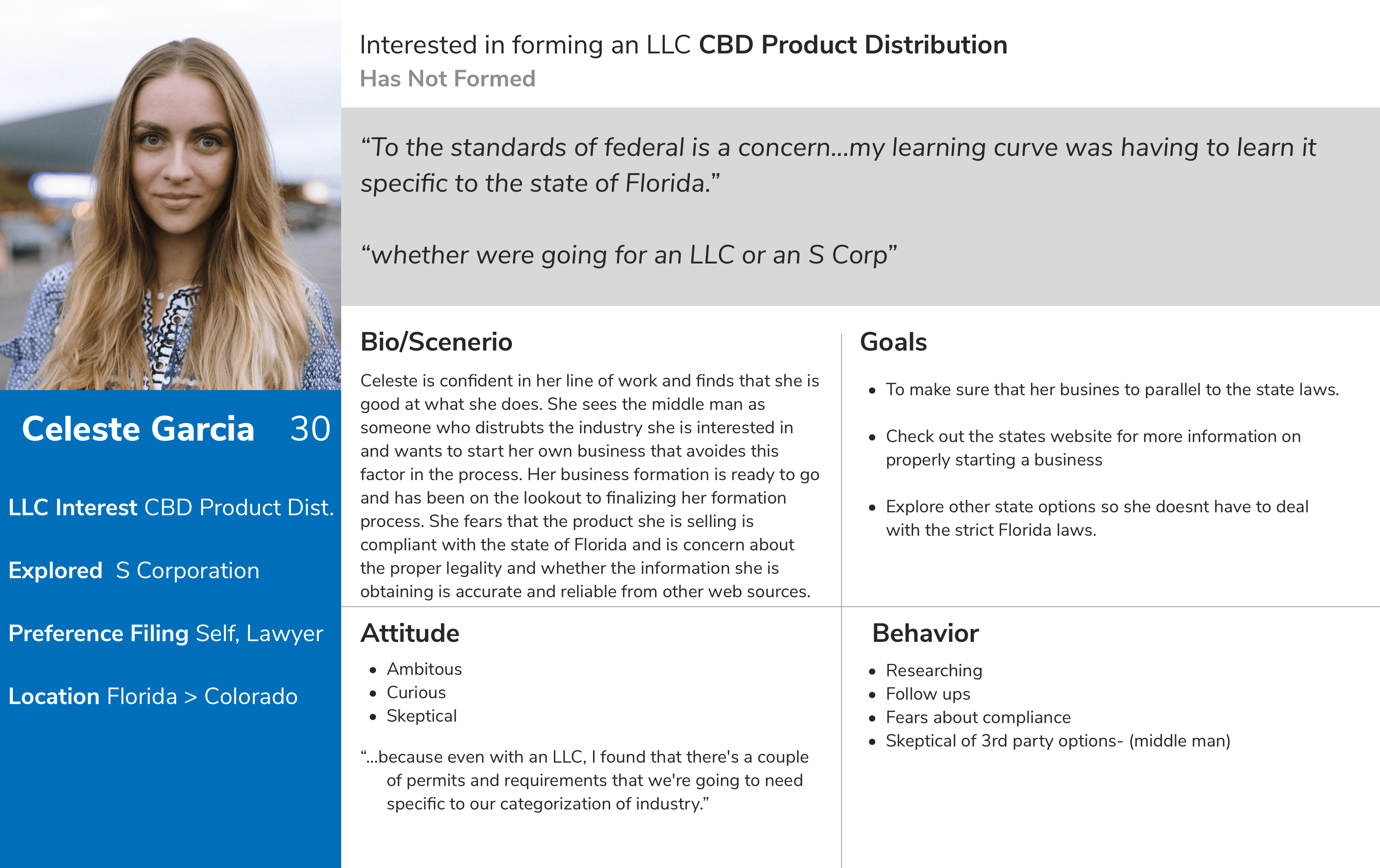
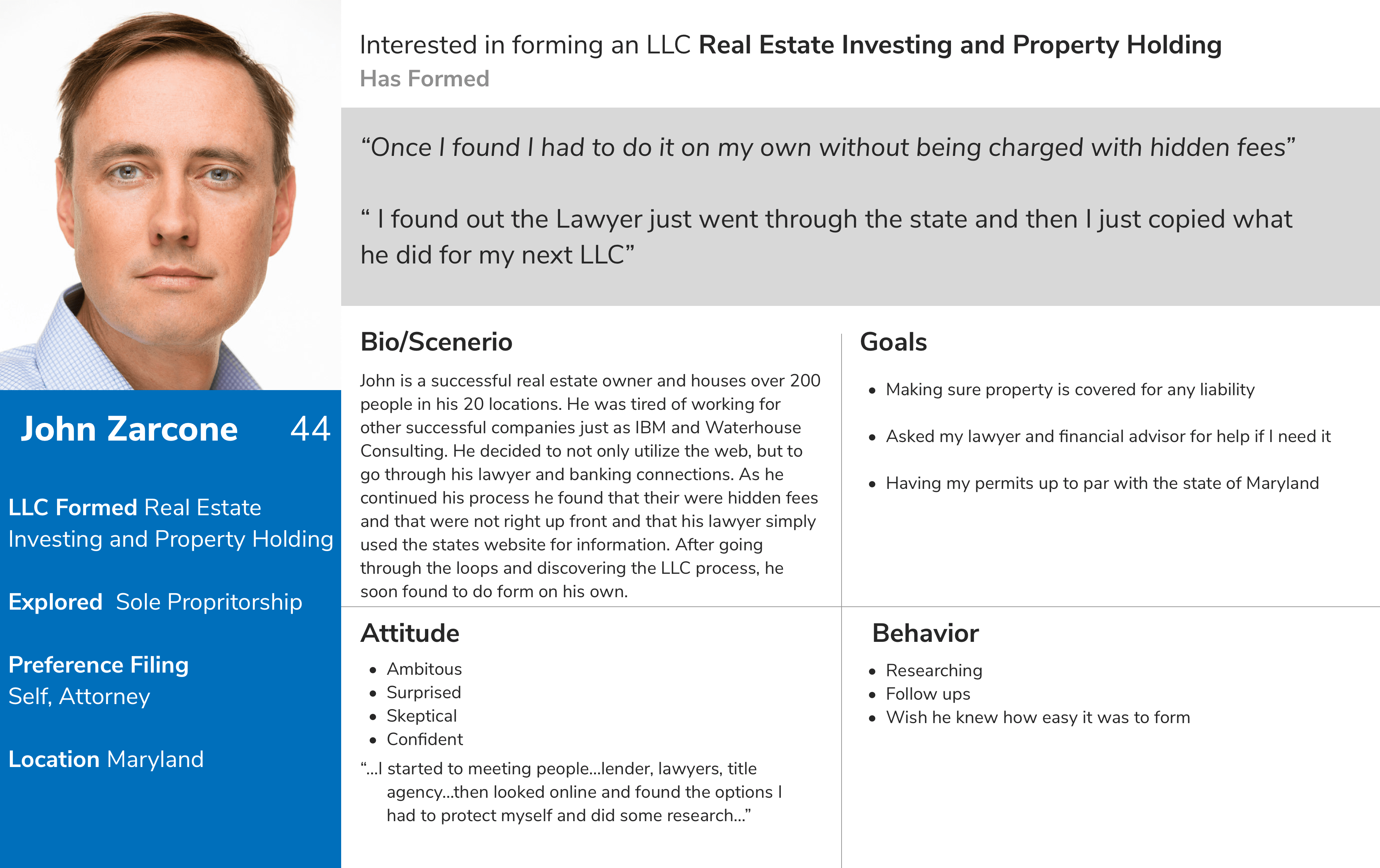
Persona
The client's goals were decided on what kind of business they would need to form and whether or not they were ready. We also tested users who have already formed and found what the convenience and inconvenience were to the process. Many were confident when they formed their business such as an LLC but others who wanted to form another entity were not so sure. Concerns were liability, laws and the proper information.
How Might We's
1. How might we
design an experience that can adapt to their education needs and understanding?
2. How might we
not overwhelm the user when exploring the site?
3. How might we
direct the user in the right direction based on their questions and concerns?
4. How might we
help the user understand next steps in the process?
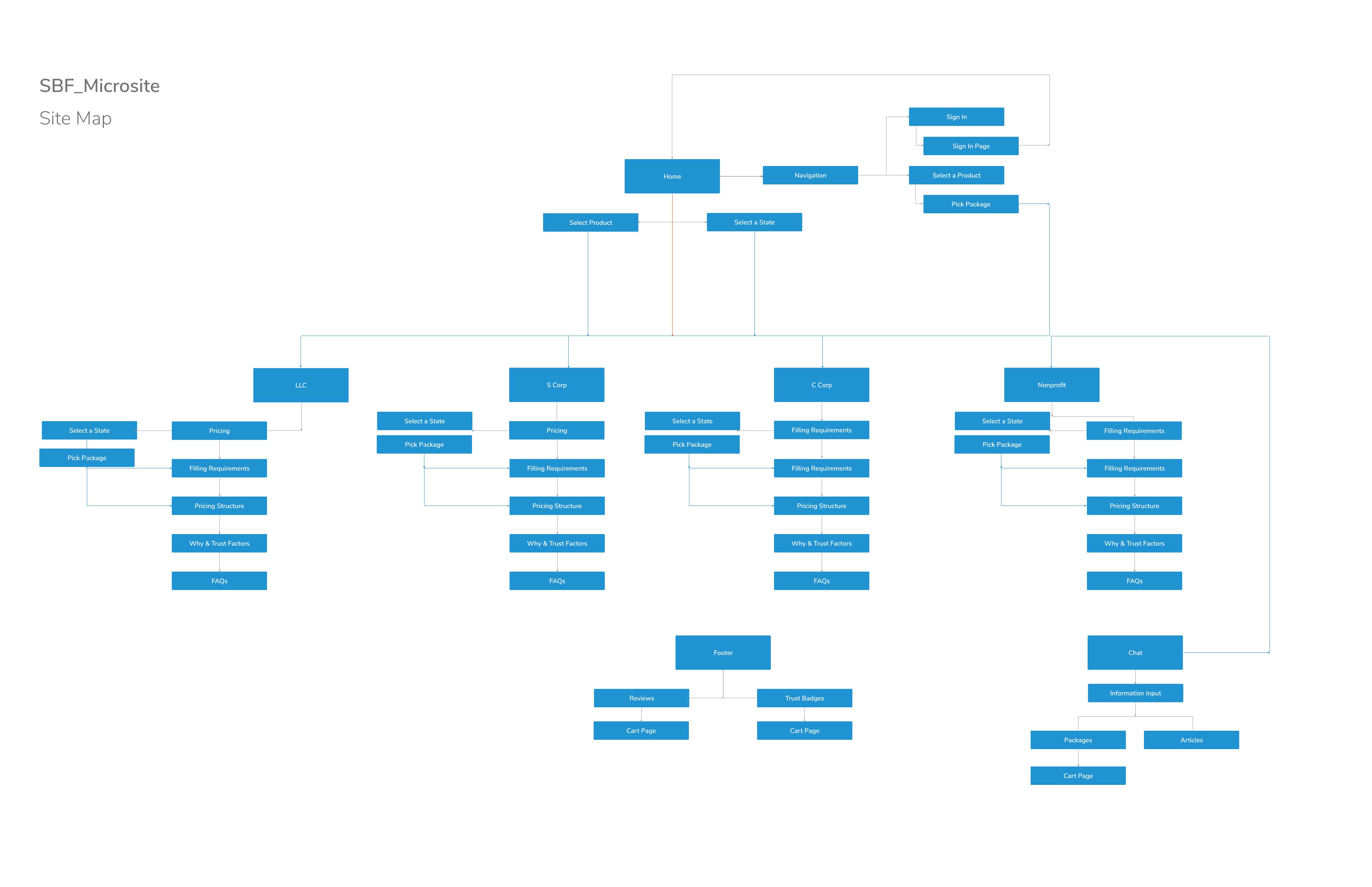
Process Flow Chart
1. Influence the user
2. Provide selection of business to pick from
3. Display reviews
4. Trust factors
5. Leadpath
6. Badges
The 5 W's
1. Who
We are creating a solution for mental health for type 1 Diabetic users.
2. What
The screeners will be using a glucose reader application for mobile.
3. Where
This application will be synced to most CGMs.
4. When
This application will be used during all hours.
5. Why
If there is a low and high blood sugar alert, then the user won't feel panicked or stressed.
Crazy-4s
I consider this process exciting because I am able to work well under pressure. It also allows me to not solely choose and fall in love with the first design I make. The team broke down the process to 4s due to timing constraints and priorities from the business.
Before starting, I identified 5 main screens for this application: the landing page , LLC page, C Corporation page, S Corporation page, Nonprofit and Reviews.
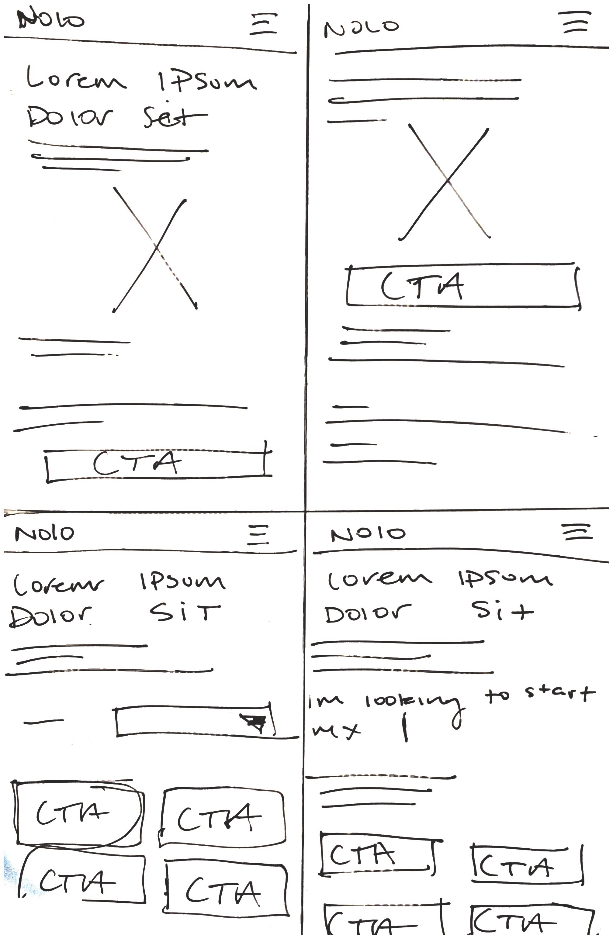
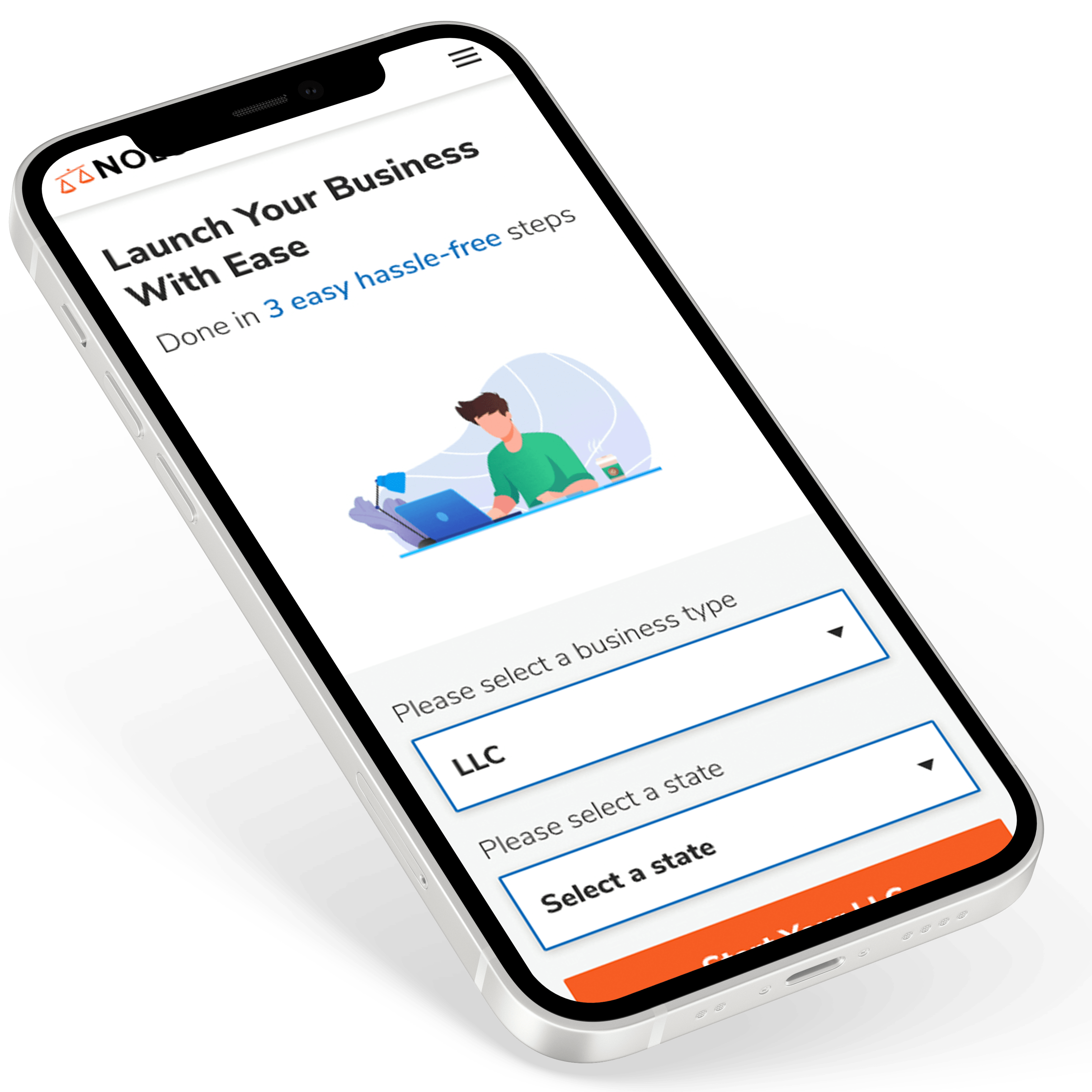
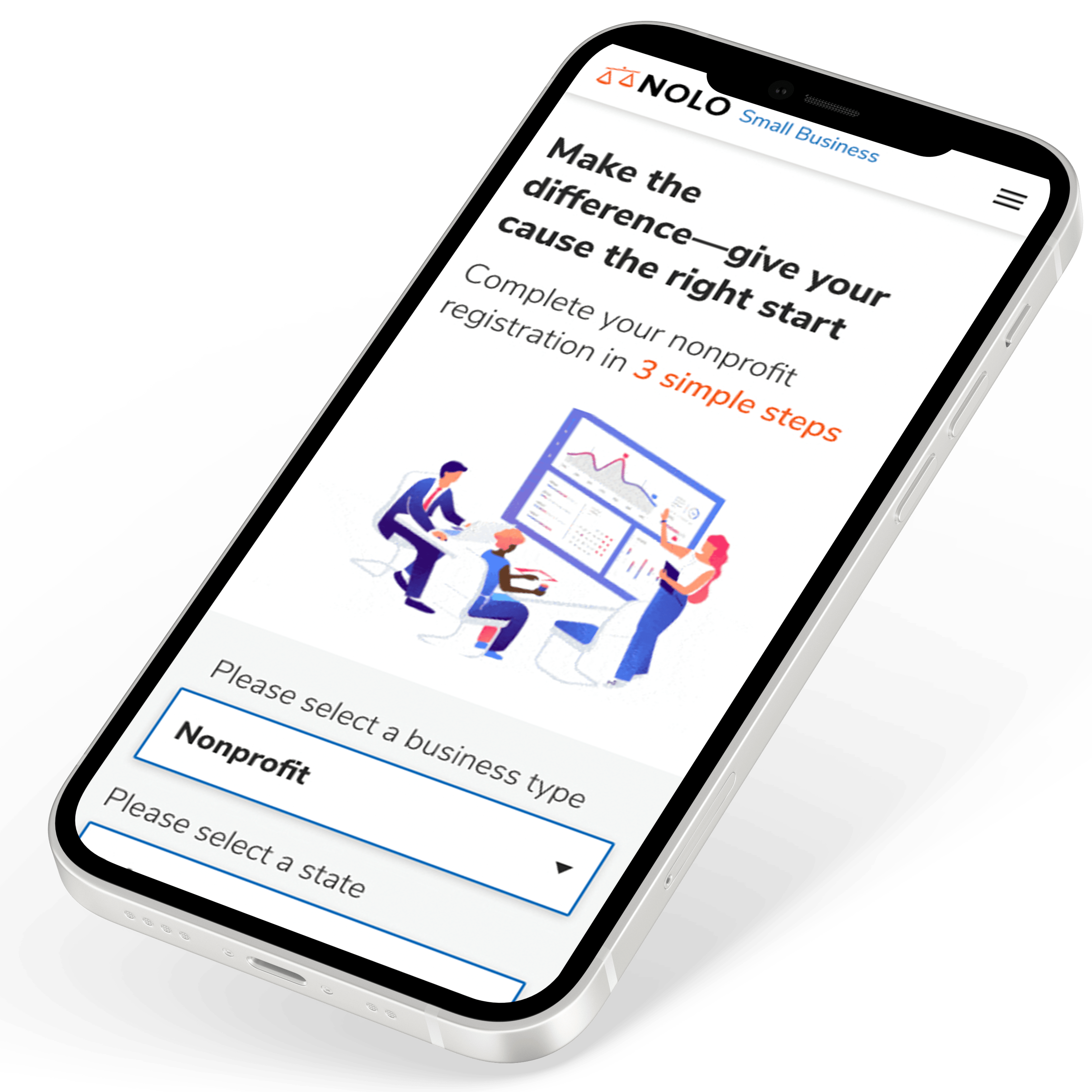
Landing Page
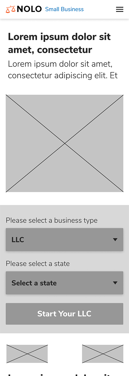
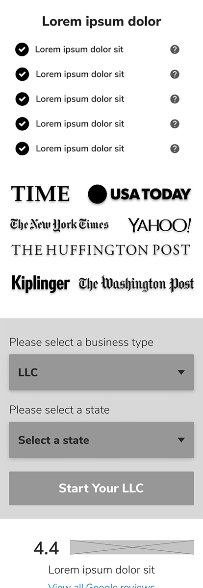
Navbar-The user was not sure how to start their business and mentioned they would need some educational links or information to guide them. So we designed a navbar that provided links to information such as a Nolo Business Quiz and articles.
Leadpaths- We provided the user with the opportunity to begin their journey in finding a lawyer to help with their decision making based on the state they live in.
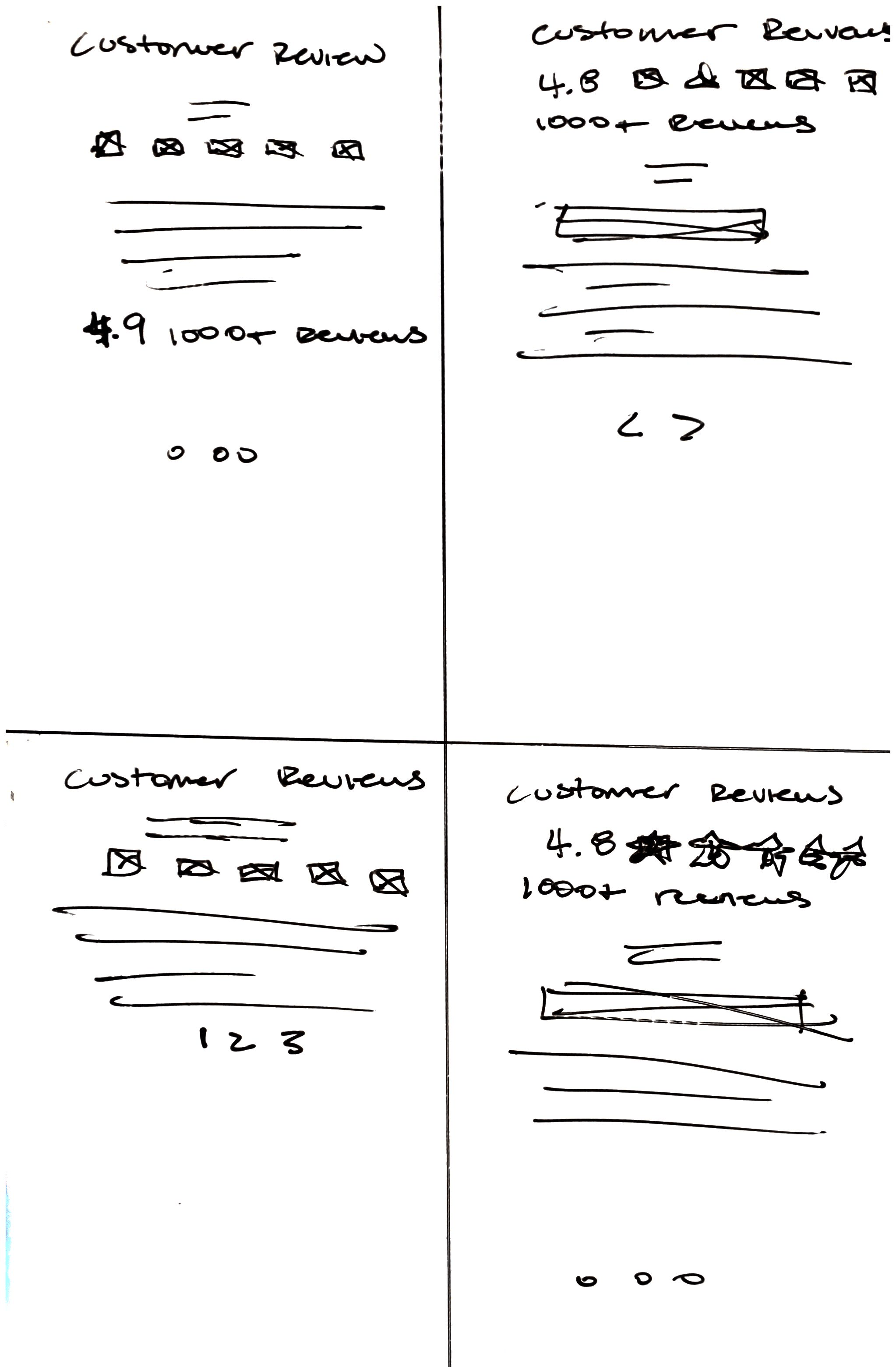
Reviews- This became important for the user because they wanted to know who else has used the product and whether or not it was trustworthy.
Trust Badges- Users wanted a sense of security and trust throughout the process.
Animation- This feature was to bring a sense of modern design and a sense of ease when using the product compared to using stock photos of actual people.
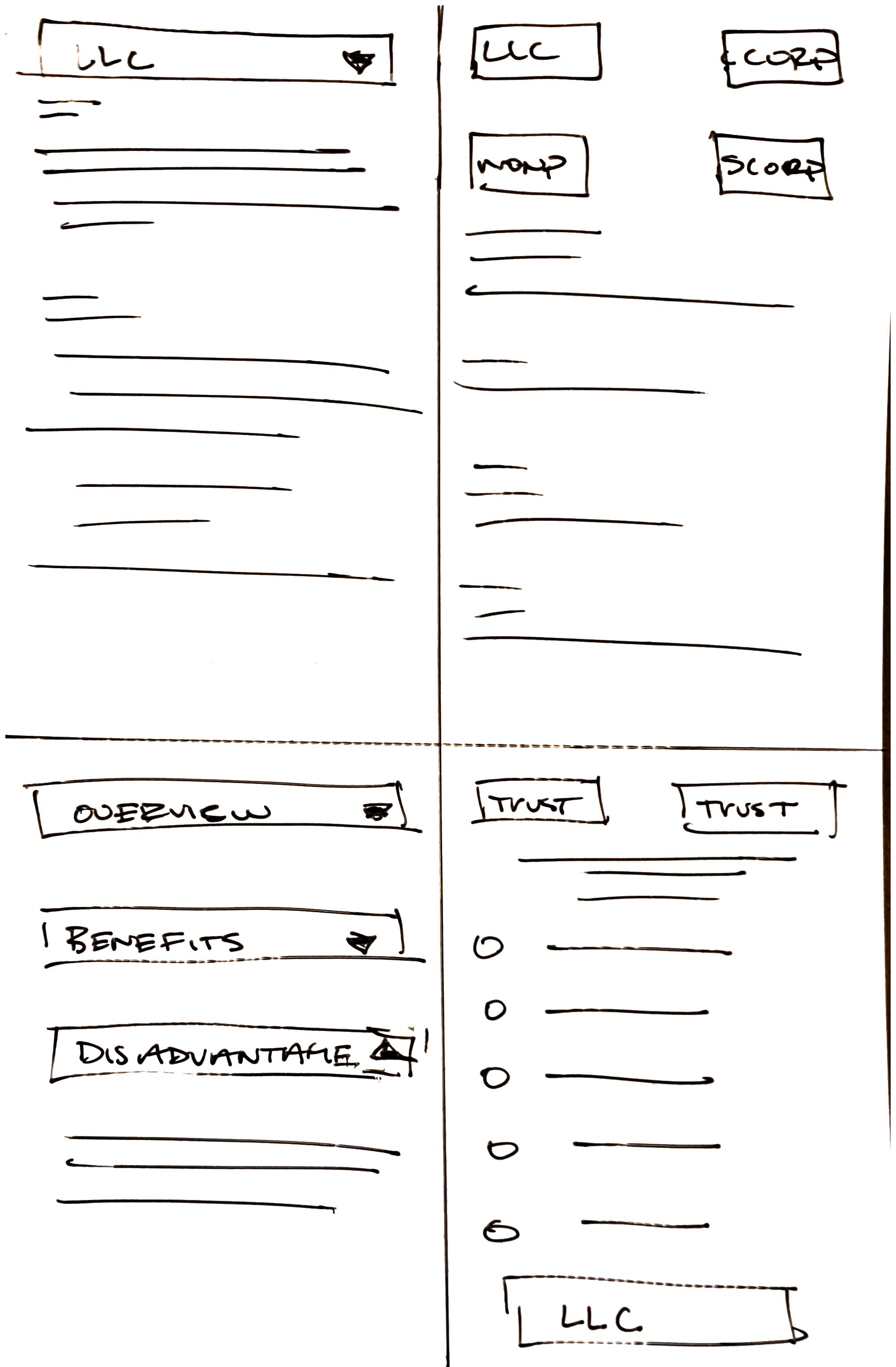
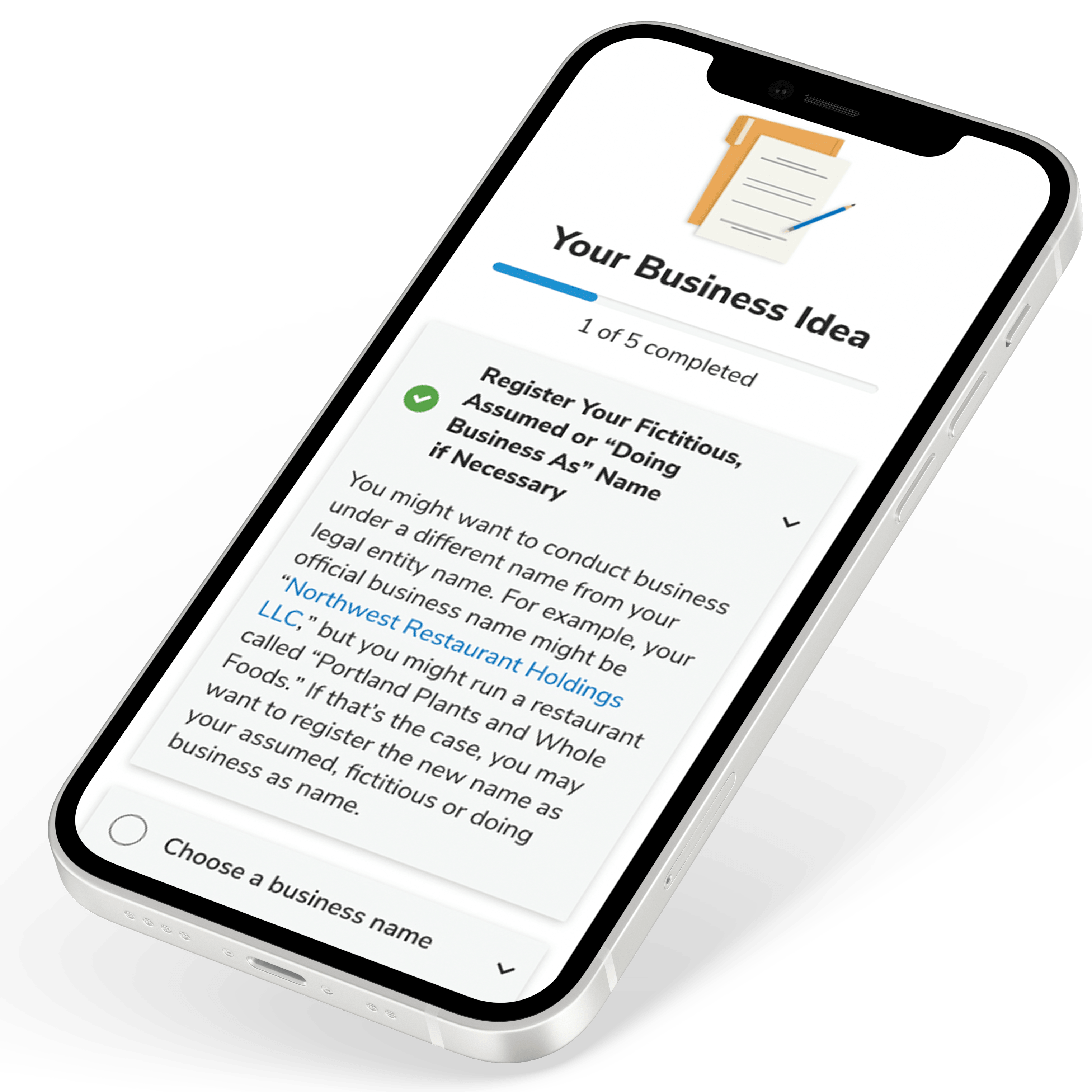
Entity Pages
Qualifications - For each entity page is displayed a unique menu of questions that they might ask themselves before starting their business our Nolo brand.
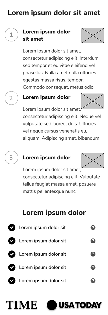
Steps to Take- User wanted to be confident in their process and whether it would be a long and strenuous journey, so we provided the 3 easy steps graphic.
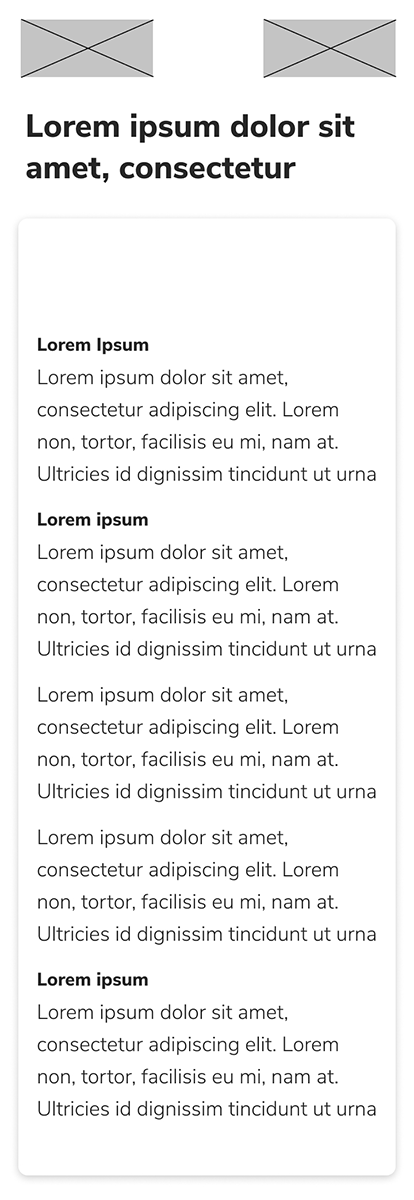
Packages Included- User also wanted to see what the package might include, so we provided hover tooltips to give them the information they need.
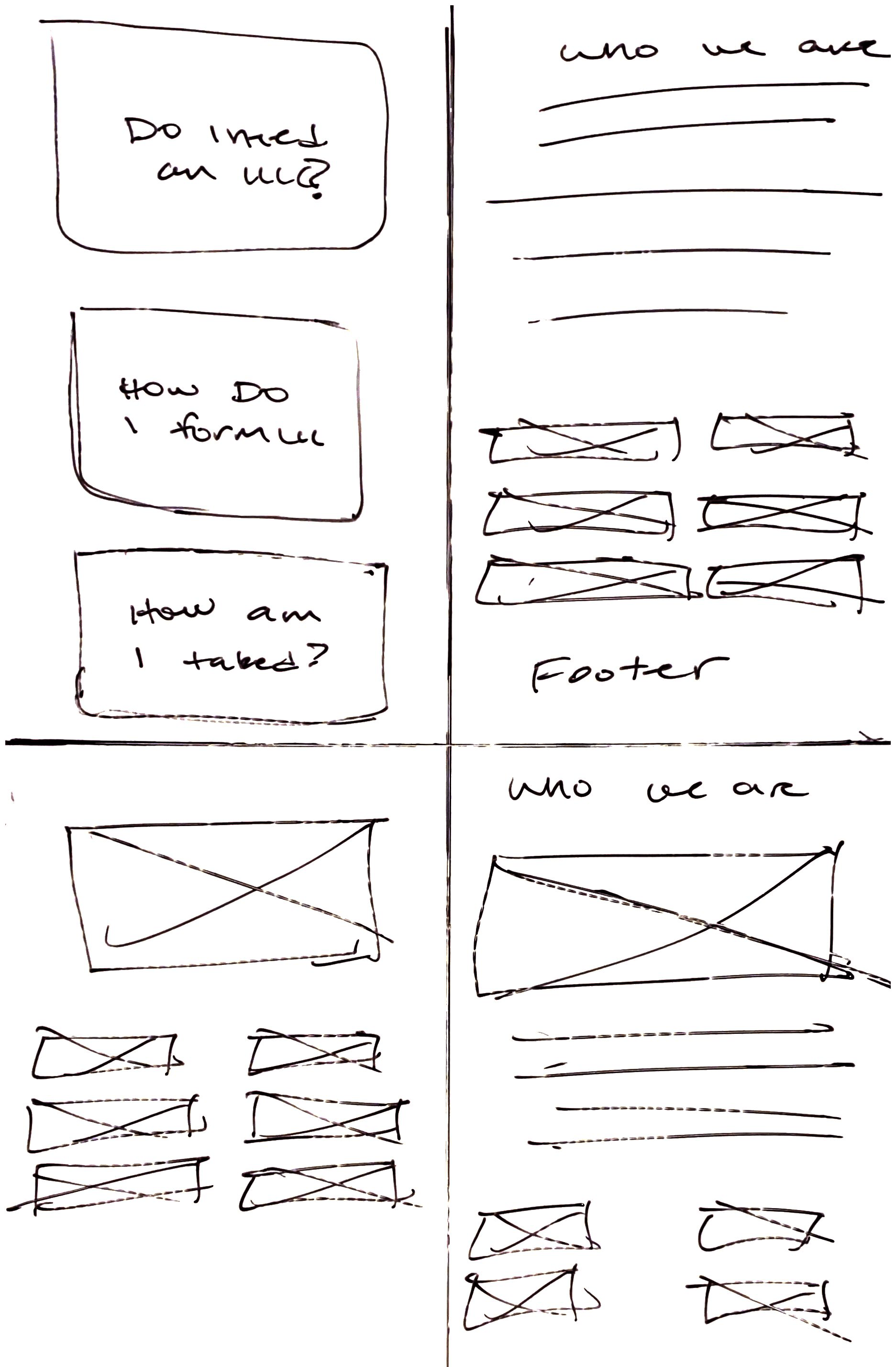
Quiz Page
Quiz-Our findings in the usertest was that the user wanted to be provided some questions to guide them in their business formation process. So we provided a quiz that had a unique outcome on the user's needs and progress in taking the next steps.
Articles-These were provided to help the user read on more information about their business decision which are written by lawyers.
Reviews Page
Reviews-This page provides a sense of trust and understanding of other users who have used the product and if it is a good fit for them or not.
All Flow
1. Arrive at landing page
2. Select product or state
3. Goes to entity page
4. Each page provides, pricing, trust factors and FAQs
5. NavBar provides articles and business quiz
Wireframes
Full walkthrough of landing page.
Testing
We decided to test remotely with the screeners through Usertesting.com and Google Calendar. Since the prototype was built using Figma, we examined each user on setting up their device and personalizing their settings, we looked for:
• The users navigation speed between screens (after giving them a few minutes with the application)
• Different use-cases: - Are they having a hard time inputting information - Were there too many options displayed - Can we make the settings easier to understand
User-feedback and Refinements
After conducting a usability test with the users, they provided invaluable feedback:
Feedback 1-The layout of the page is very minimal and provides enough information to stay informed and confident in the next step, but looking for a better order of operation with the information.
Solution 1 - Look back at the order and find a journey that guides the user. The user was able to provide clear feedback and we found that the layout needed some adjustments.
Development
Once I received confirmation from the users, I delivered the prototype and assets to our developer. The application is built in the Nolo Managing System, a tool that the developer can rapidly deliver capabilities and its ability to test throughout the office. Over the next two weeks, we met on a regular cadence to see how the experience progressed. We were able to achieve a finished application that was ready for production in record time.
Refinements and Support
Feedback 1 - They communicated that the design needed an easier color scheme for a business related mindset and motivation.
Solution 1 - We decided on light blue for the lander page design and then dynamically changed per each entity based on the Nolo Quasar Style Guide.
Feedback 2 - Users found some of the animations not working with the content.
Solution 2 - We found other animations that were more relatable to the product.
Key Takeaways
1. I needed to empathize rather than sympathize
When we were testing the application with the users, I had thought that I covered everything they would need. I was proven wrong when they gave me their feedback.
2. No matter how you test, it cannot compare to real-world scenarios
I think it can explain all potential pain points during testing, but there are always improvements to be made. I knew that modifications were imminent, so I am pleased that it was ready.
3. The flowchart is the source of truth
Creating a flowchart gave me a better understanding of how to structure the solution. I pointed this out constantly throughout the project and it helped remind me what I need, why, and where it belongs in the process.
Final Product
1. I needed to empathize rather than sympathize
When we were testing the application with the users, I had thought that I covered everything they would need. I was proven wrong when they gave me their feedback.
2. No matter how you test, it cannot compare to real-world scenarios
I think it can explain all potential pain points during testing, but there are always improvements to be made. I knew that modifications were imminent, so I am pleased that it was ready.
3. The flowchart is the source of truth
Creating a flowchart gave me a better understanding of how to structure the solution. I pointed this out constantly throughout the project and it helped remind me what I need, why, and where it belongs in the process.
Homepage>Entity Lander
Corporation/Nonprofit Landers