Founding Designer
Diabetes and Mental Health AppDiaBright
Hypothesis: Patients with diabetes are more likely to suffer from common mental disorders, a finding which is highly relevant, given that psychiatric comorbidity in people with diabetes is also associated with higher levels of functional impairment, impaired quality of life, and difficulties with diabetes self-care.
- User: Type 1 and Type 2 Diabetic Patients
- April, 2019
- Team: UI/UX Designer(me)
- Tools
- Research: Google Doc, Google Scholar, Gchat for testing
- Ideation: Pen and paper
- Wireframing and Prototyping: Adobe XD
- Visual Design: Adobe Illustrator and Photoshop
- Duration
- 4 months
Problem
1. How might we
design an experience that can adapt to type 1 Diabetics and their emotional mental health when dealing with their autoimmune disease?
2. How might we
accelerate the emotional identification process?
3. How might we
account for patients and custom unique settings when dealing with technology and Diabetes?
4. How might we
gather information and effectively test this product?
5. How might we
get a hold of someone when a user is having extremely dangerous low blood sugar?
How might we
get a hold of someone when a user is having a very high blood sugar?
Solution
Design an application (mobile) that will relate to the user and provide a stress free and hopeful mental state of mind. We're designing for mobile because the user is mainly on the go. While collaborating with the users we were able to create a sustainable product through constant iterations and testing.
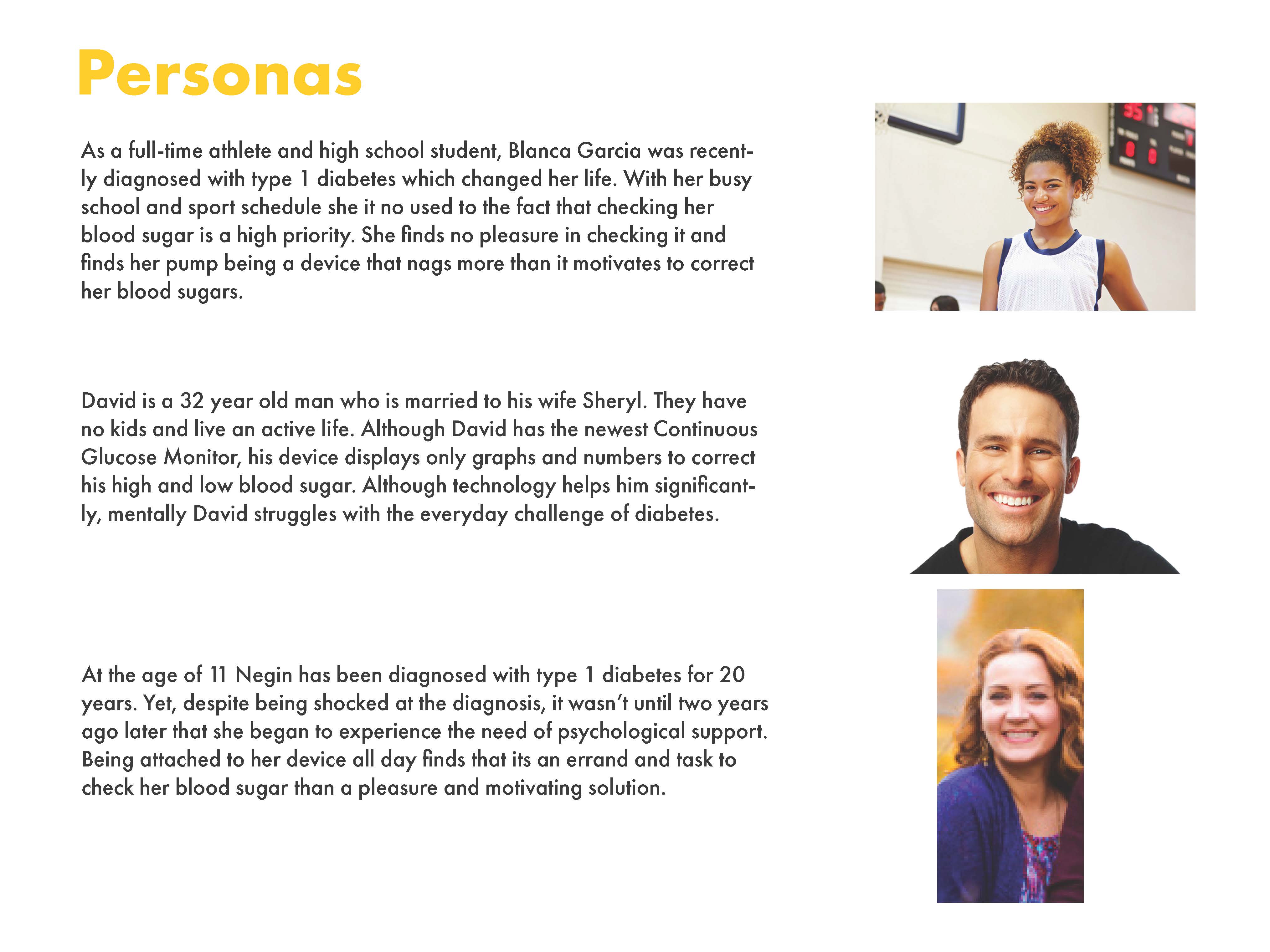
Persona
The client's goals were to roll-out an application that is easy to learn, offers custom settings, and quick to suggest recommendations during a hypoglycemic and Hyperglycemia stage. Their main concern was their emotional state when dealing with these recurring stages.
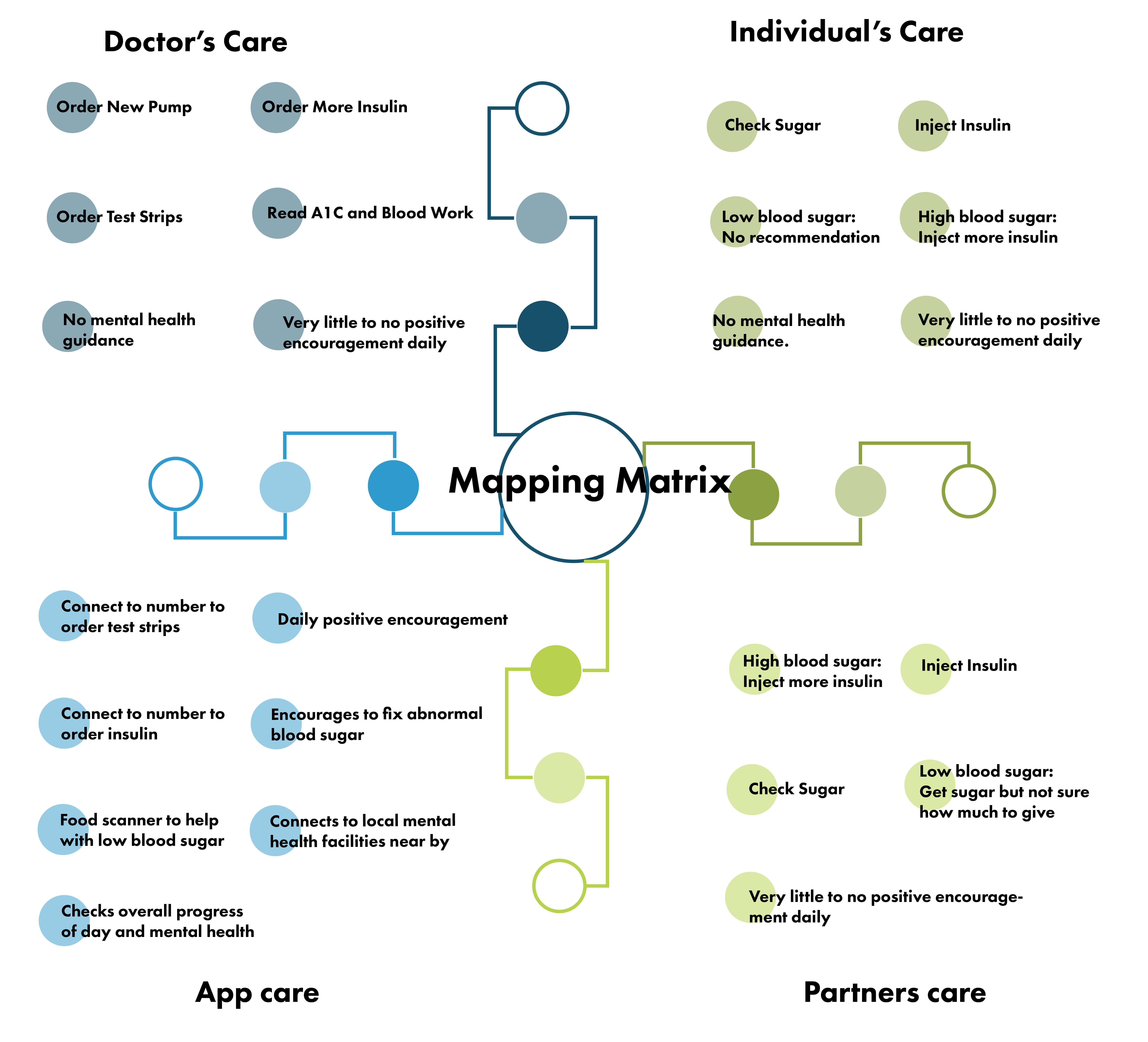
How Might We and Mapping Matrix
1. How might we
design an experience that can adapt to their mental health and provide clear recommendations during high and low blood sugar stages?
2. How might we
calm the user when in a high or blood sugar state?
The client informed me that every once in a while they feel down and mentally exhausted after coming back from low blood sugar. I determined that the application should have the ability to recommend how much water to drink or steps to take during a high blood sugar, and having an auto emergency call during a low blood sugar stage?
3. How might we
account for employees that are being alerted for their low or high blood sugar stage. I determined that the application should have the ability to sync your song library so the alerts are not agonizing and daunting to the user?
4. How might we
display a friendlier way to display information so that it does not feel robotic. I found that adding a character based off of the baby face bias. This would allow the user to select a character from human form to animal form?
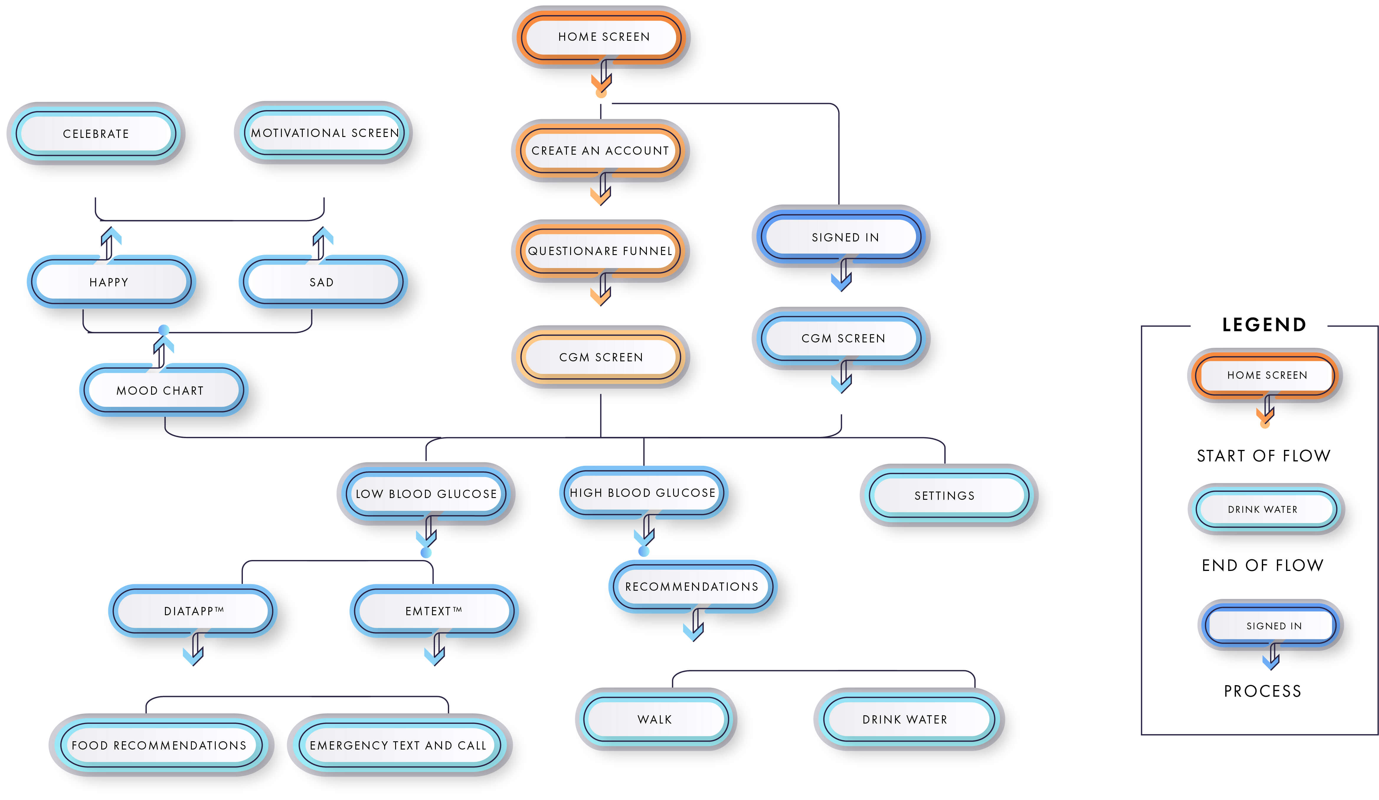
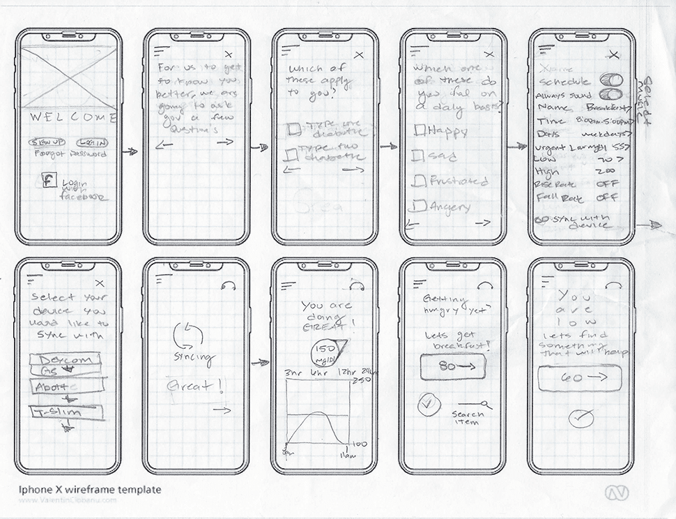
Process Flow Chart
After the application features were brainstormed creating a flowchart was the next step.
The 5 W's
1. Who
We are creating a solution for mental health for type 1 Diabetic users.
2. What
The screeners will be using a glucose reader application for mobile.
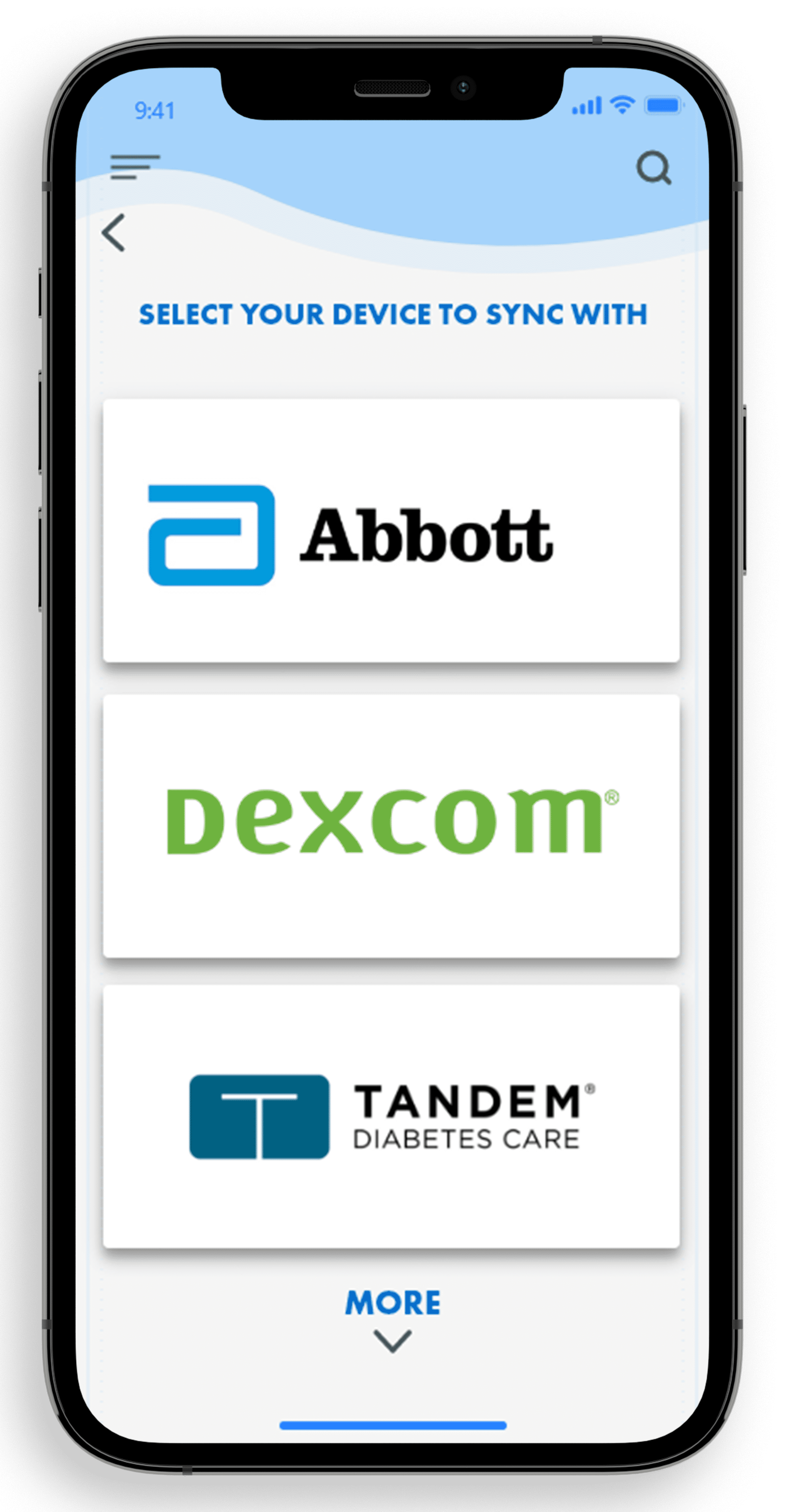
3. Where
This application will be synced to most CGMs.
4. When
This application will be used during all hours.
5. Why
If there is a low and high blood sugar alert, then the user won't feel panicked or stressed.
The client and I determined that the application should allow the user to tap on screen for confirmation before an emergency call is activated. We also determined that there needs to be a mood chart with recommendations if their average happiness is going down. Once I received confirmation, the next step was to sketch my ideas.
Crazy-8s
I consider this process exciting because I am able to work well under pressure. It also allows me to not solely choose and fall in love with the first design I make.
Before starting, I identified 5 main screens for this application: the home page, graphs, DiaTapp, mood chart and settings.
Main Screens
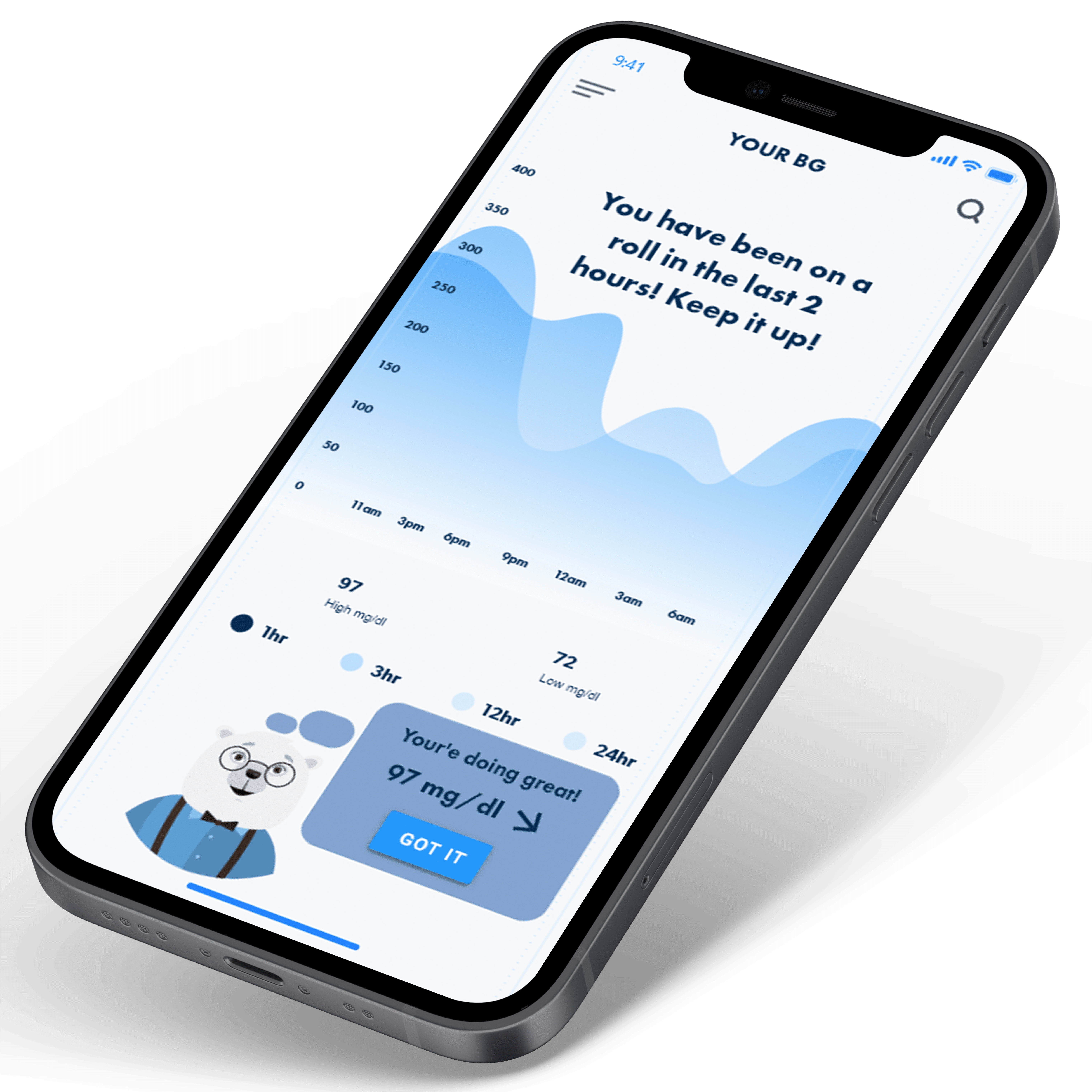
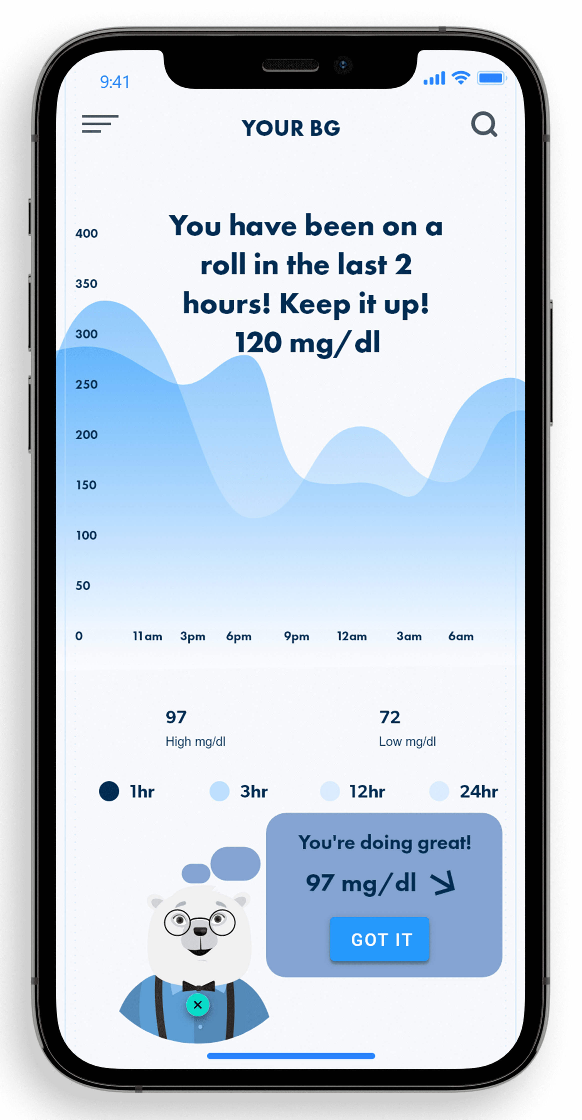
Graphs-We started with a traditional graph with lines rather than bars that were better because of the lines being easier to process.
mg/dl display-Numbers are accurate based off of their CGM sync. Accuracy will allow a better experience and avoid missing high and low BG moments.
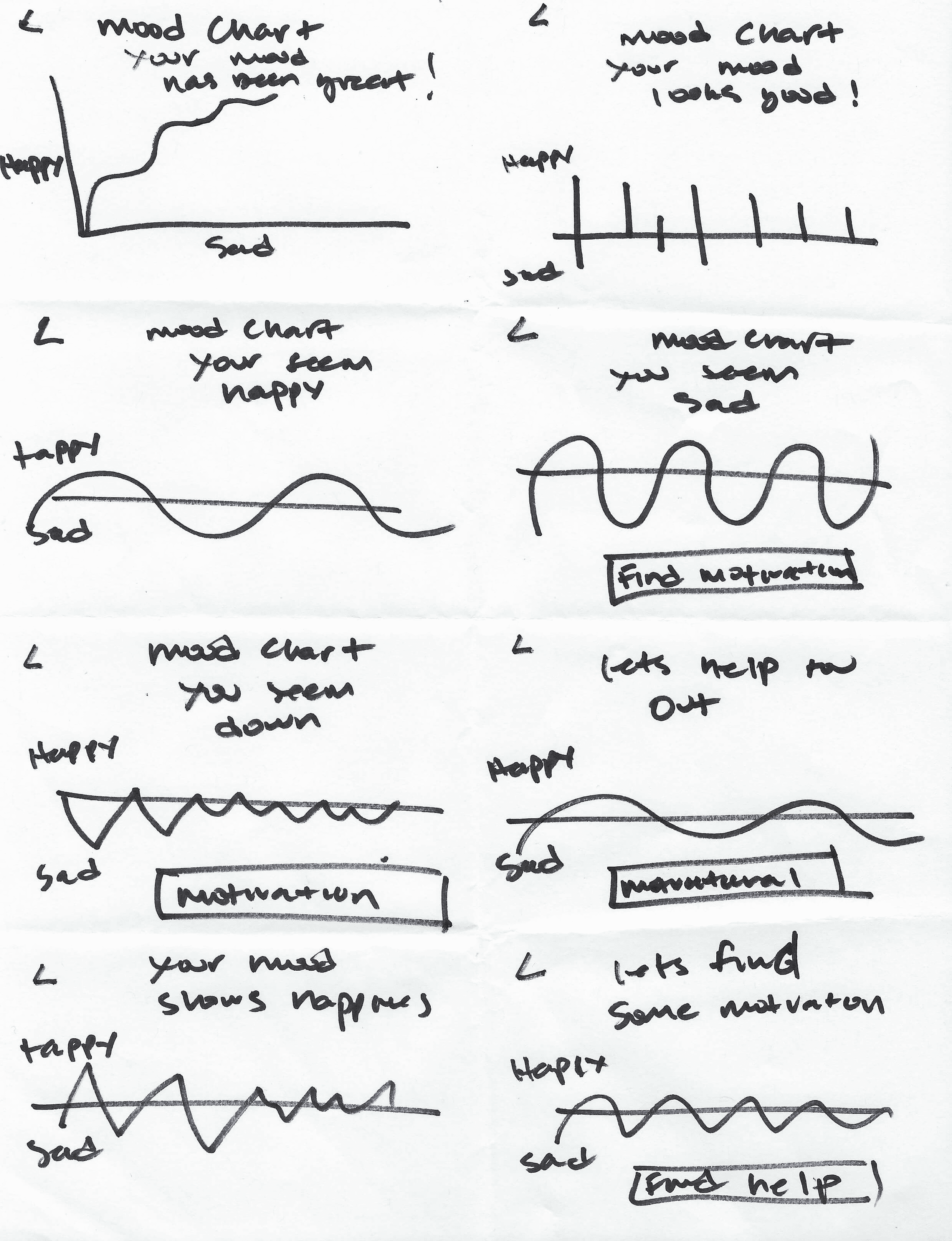
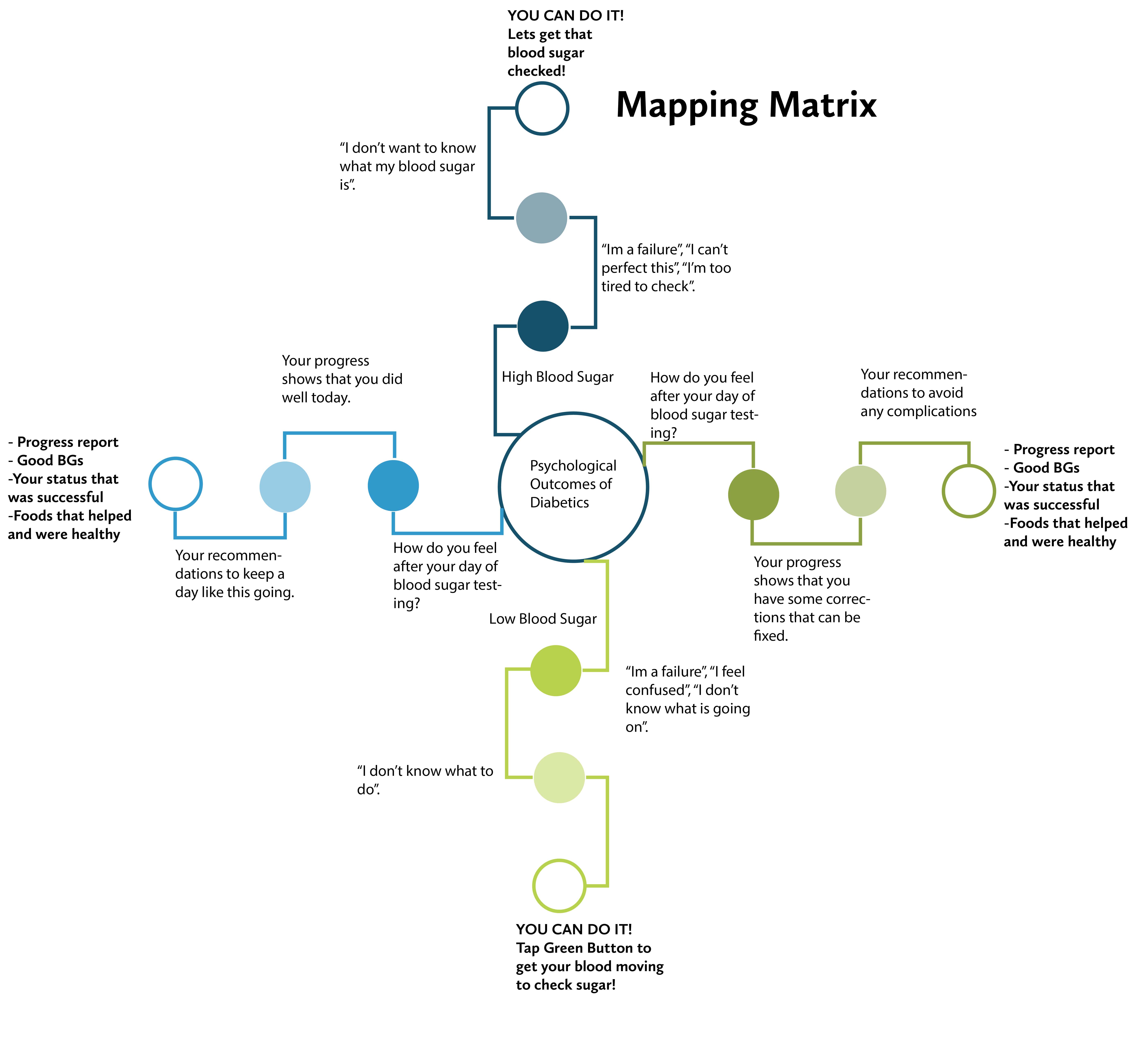
Mood Chart
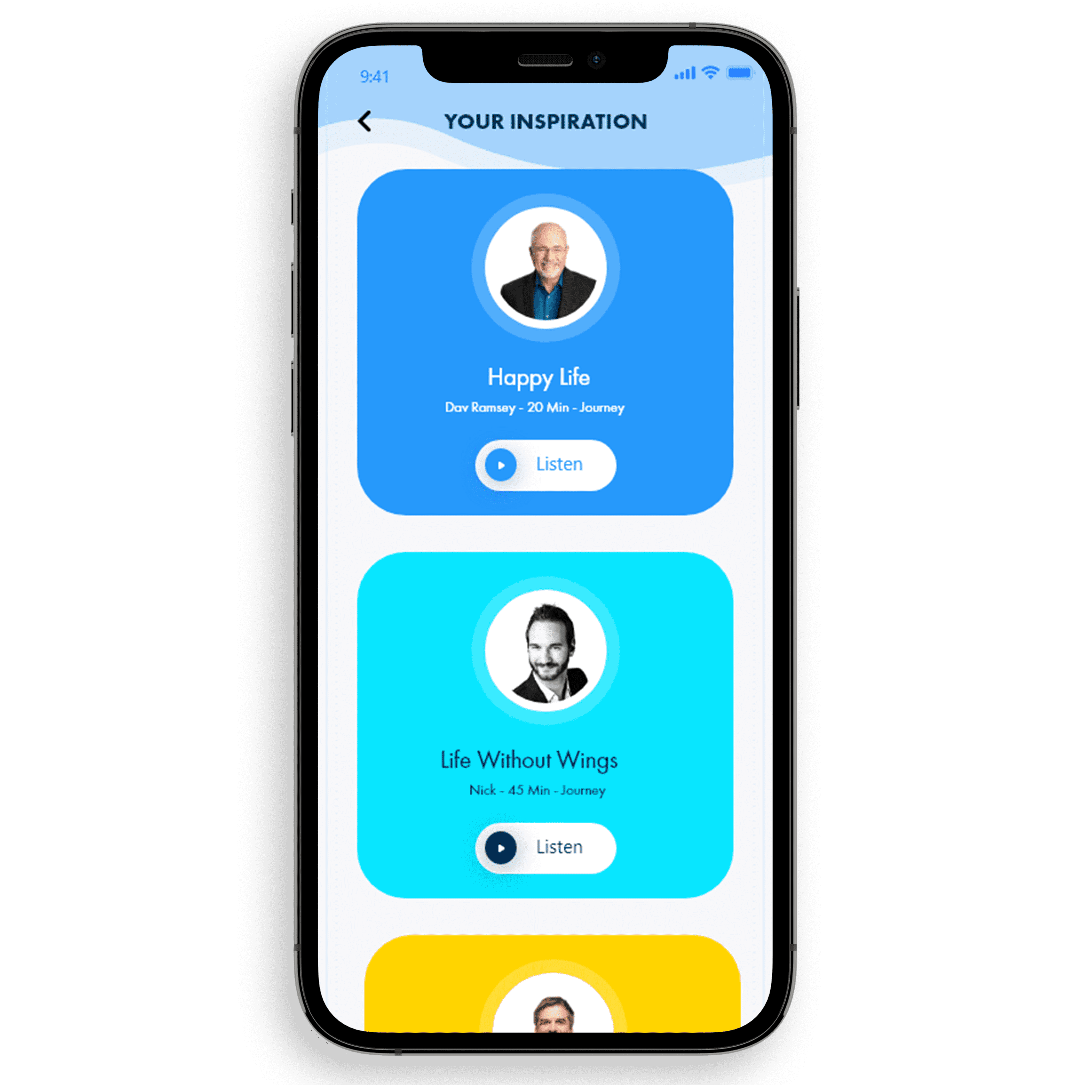
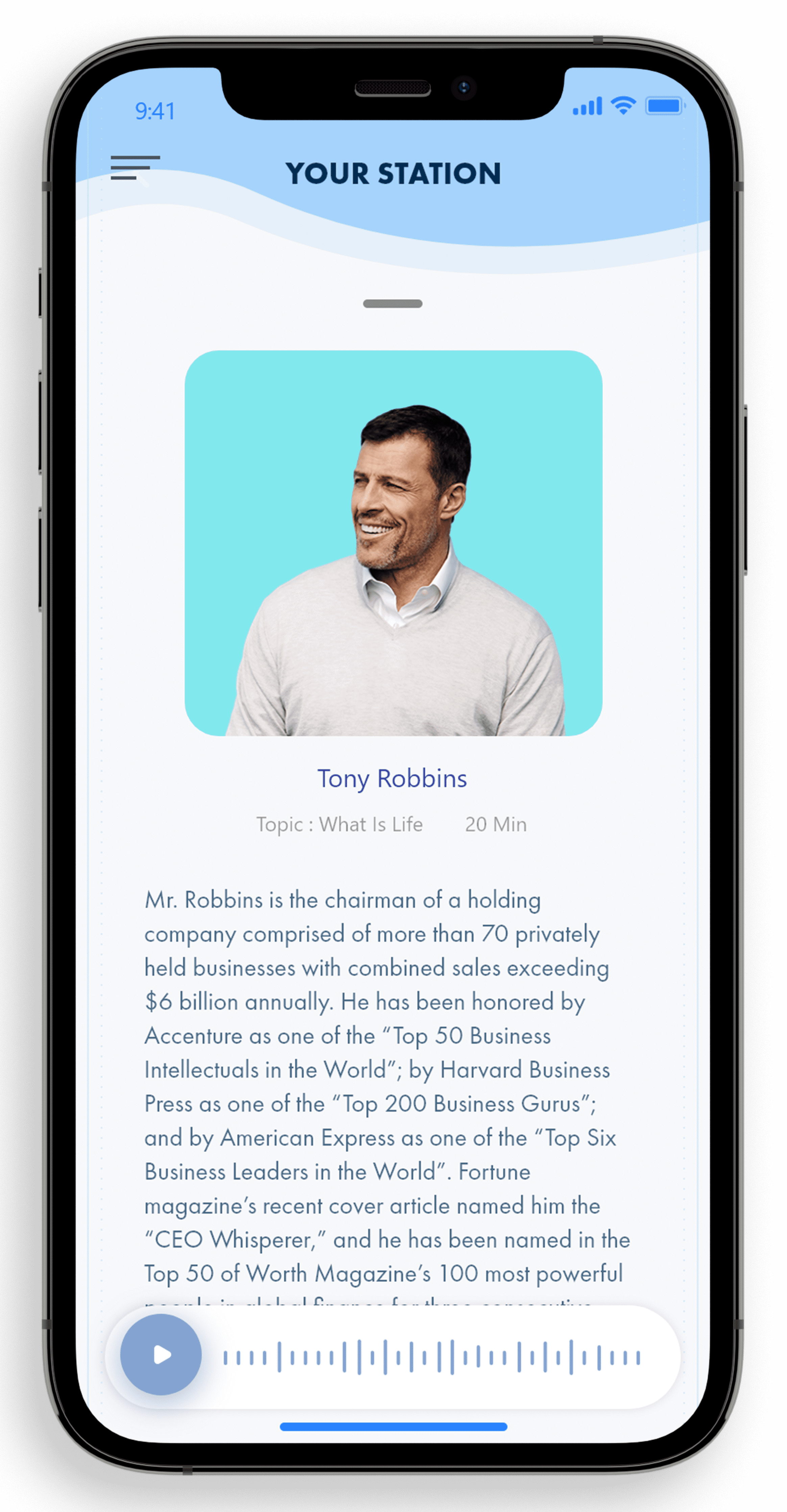
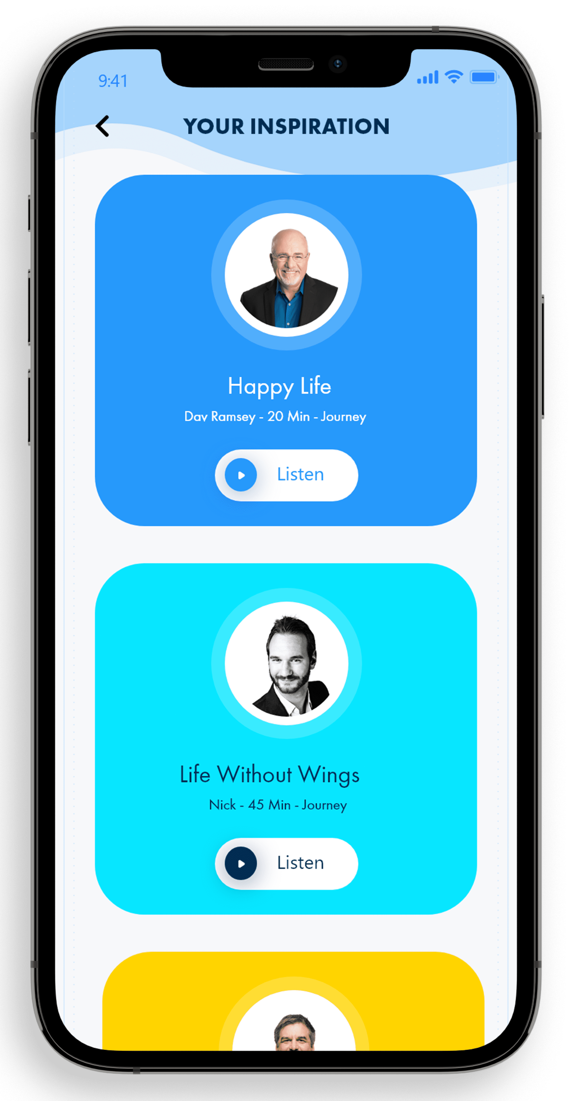
Motivation and Character-Their character will use wording that is positive during low and high BG experiences.The user will feel a more positive less robotic experience.This feature will monitor the users data by asking daily questions on their mood and will recommend motivational speakers and podcasts to bring their mood back up.

DiaTapp
The user will be able to respond to the app by providing a continuous tap so the app does not activate emergency calls and to become aware of the users status.
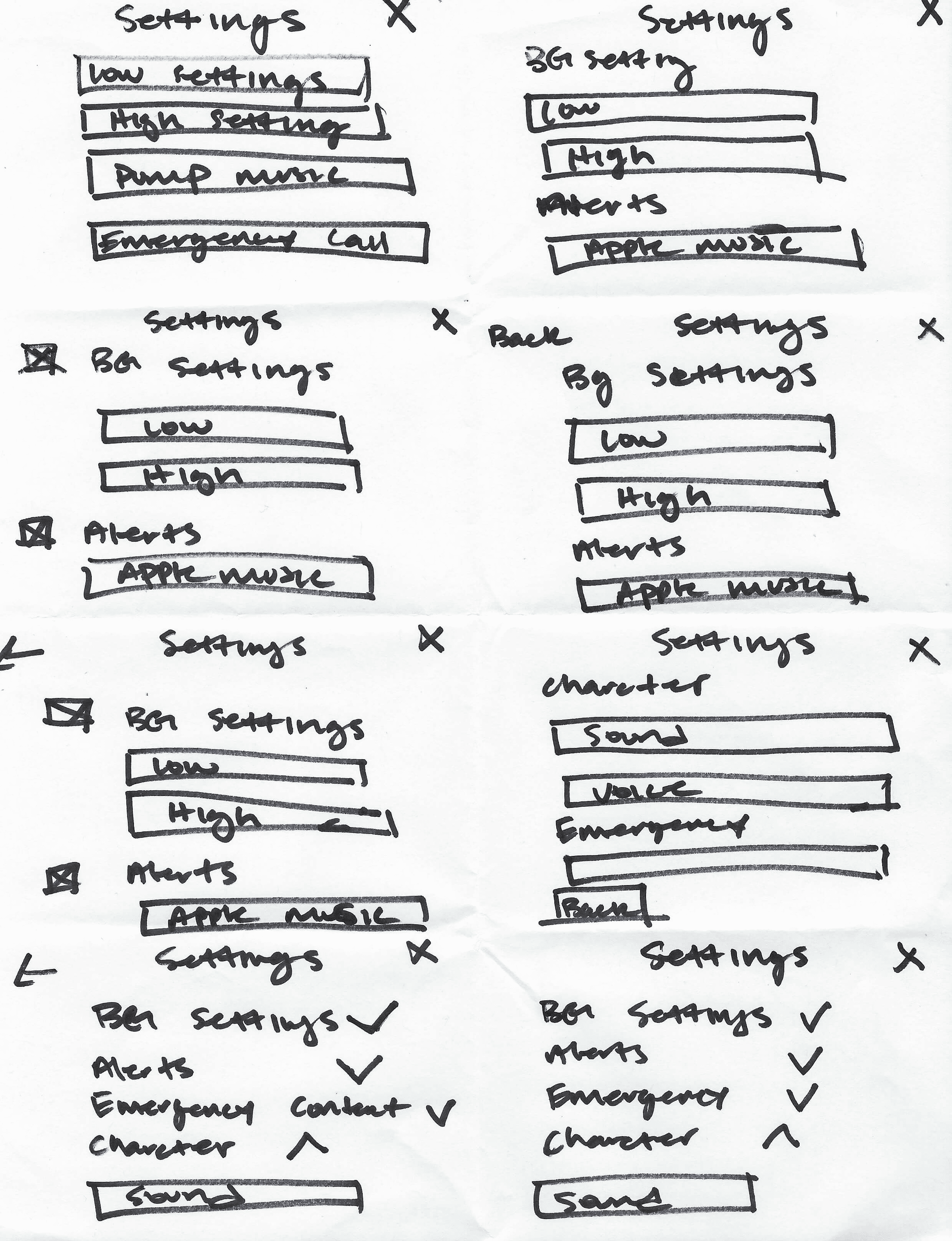
Settings
This feature will have options such as Apple Music sync for high and low alert settings, character selection, notifications and much more.
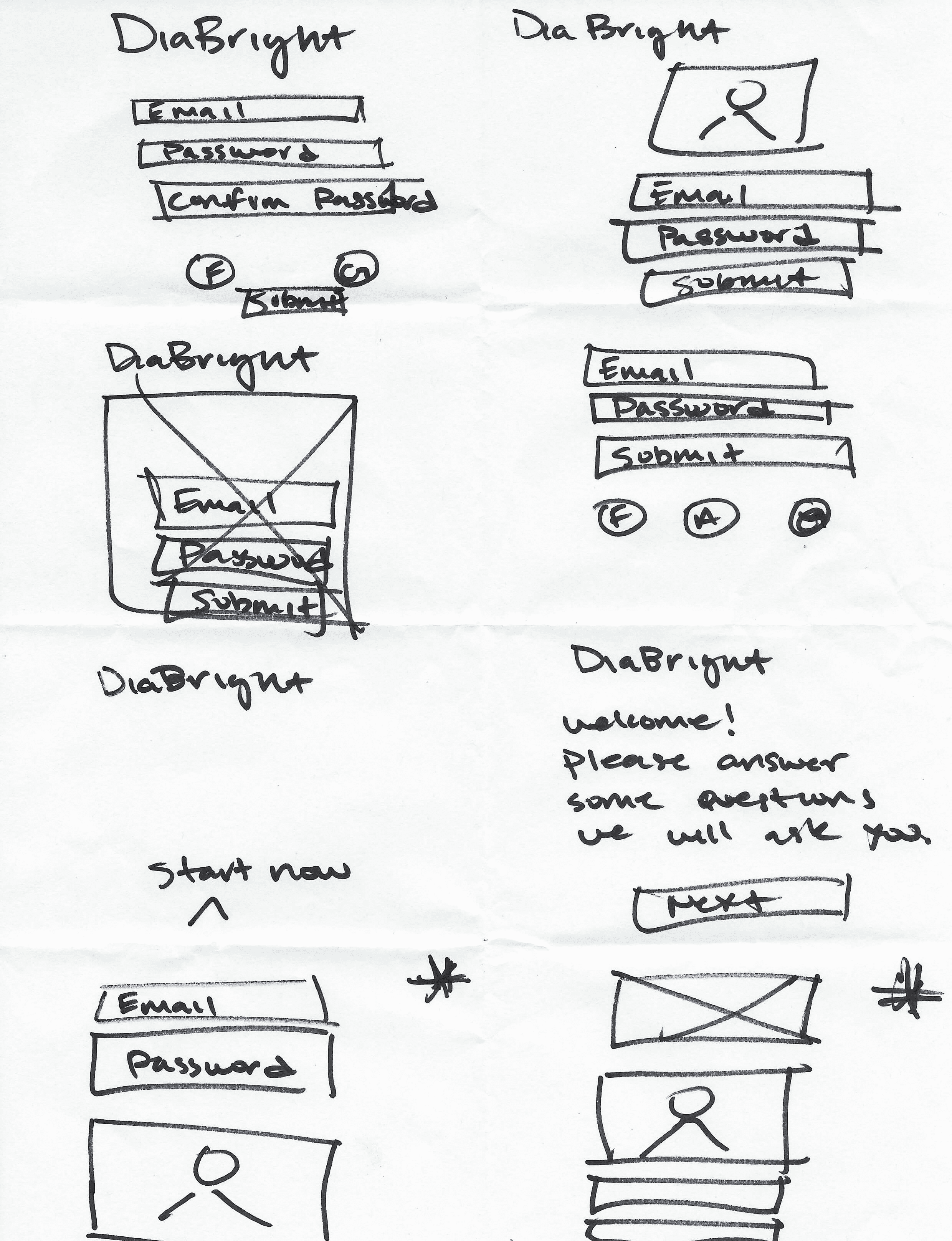
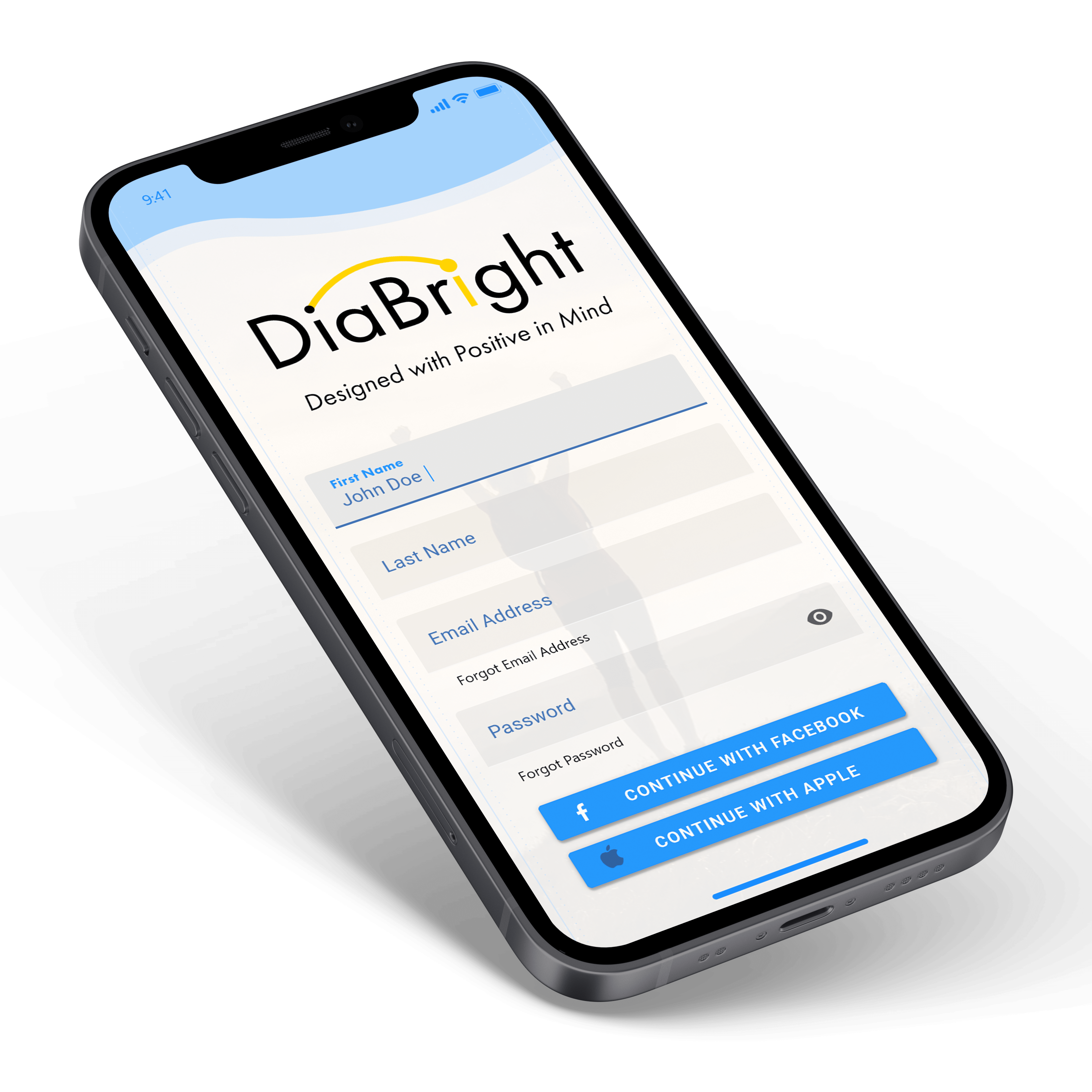
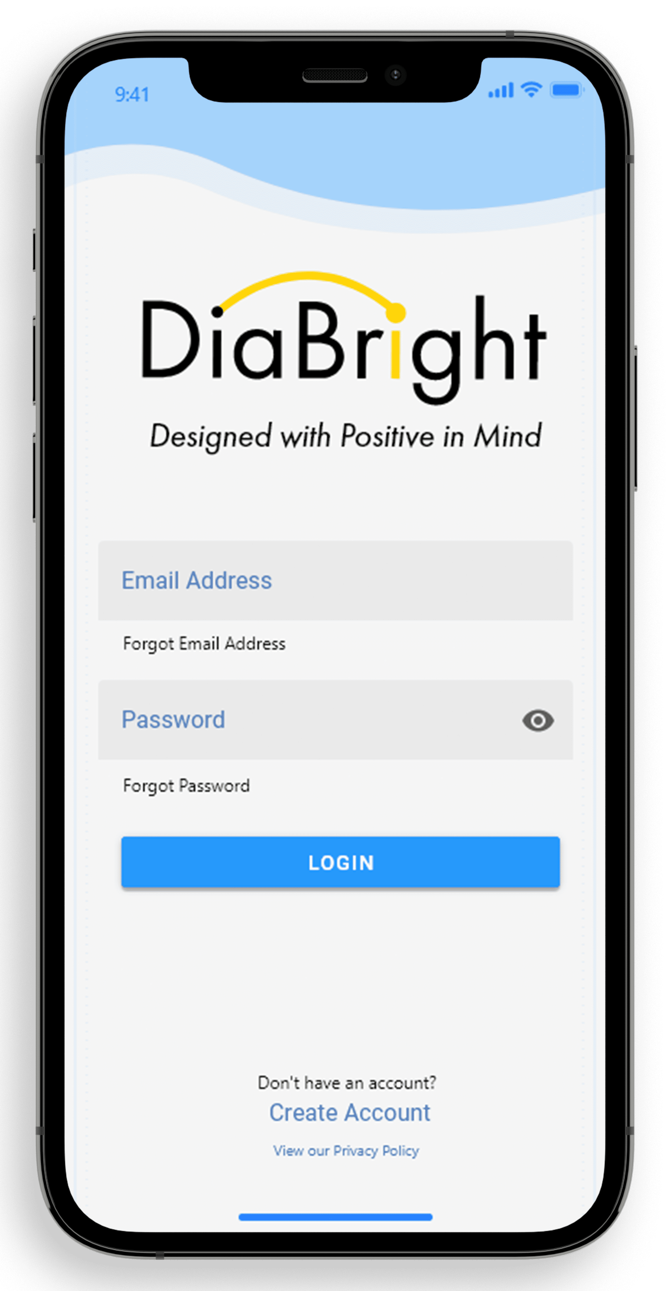
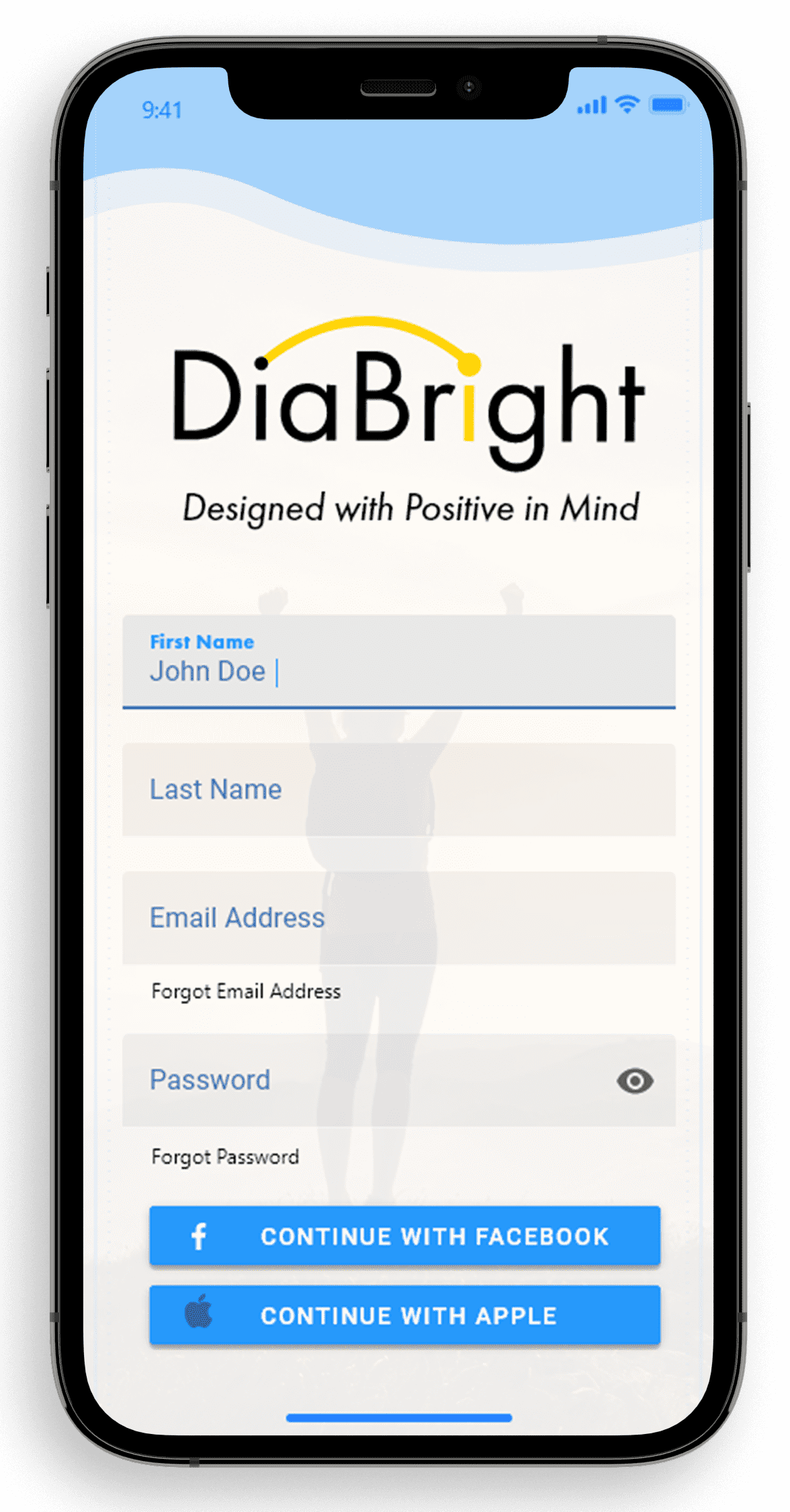
Home Screen
I wanted the user to have a clear experience when signing up for the app. They will be asked a series of questions that will guide their experience and expectations.
Final Sketches
We went back to the users and found some changes that were a possible implementation and started the final sketch process.
Main Screens
Layout-We used a traditional graph with an x and y axis but wanted to be more modern on the way the BG were tracked. We decided that the color scheme would be blue because it would be most relaxed for the user. Then we decided on a concept from light to dark blue, fading being passing time and more solid blue as current time.
Character-The user's selected character will appear to give them a reminder of how it is going.
Graphs-Graphs allow the user to easily find and determine their BG. The more faded blue is the time passing and the more visible blue is the current time.
mg/dl display-We found that displaying the mg/dl number in multiple places would help the user scan their information easier.
Motivation-Positive encouragement and words were found by going through word phrases and synonyms.
Search-Allows the user to search motivation videos or other features of the app.
Got it button-Confirms that the user has acknowledged their character.

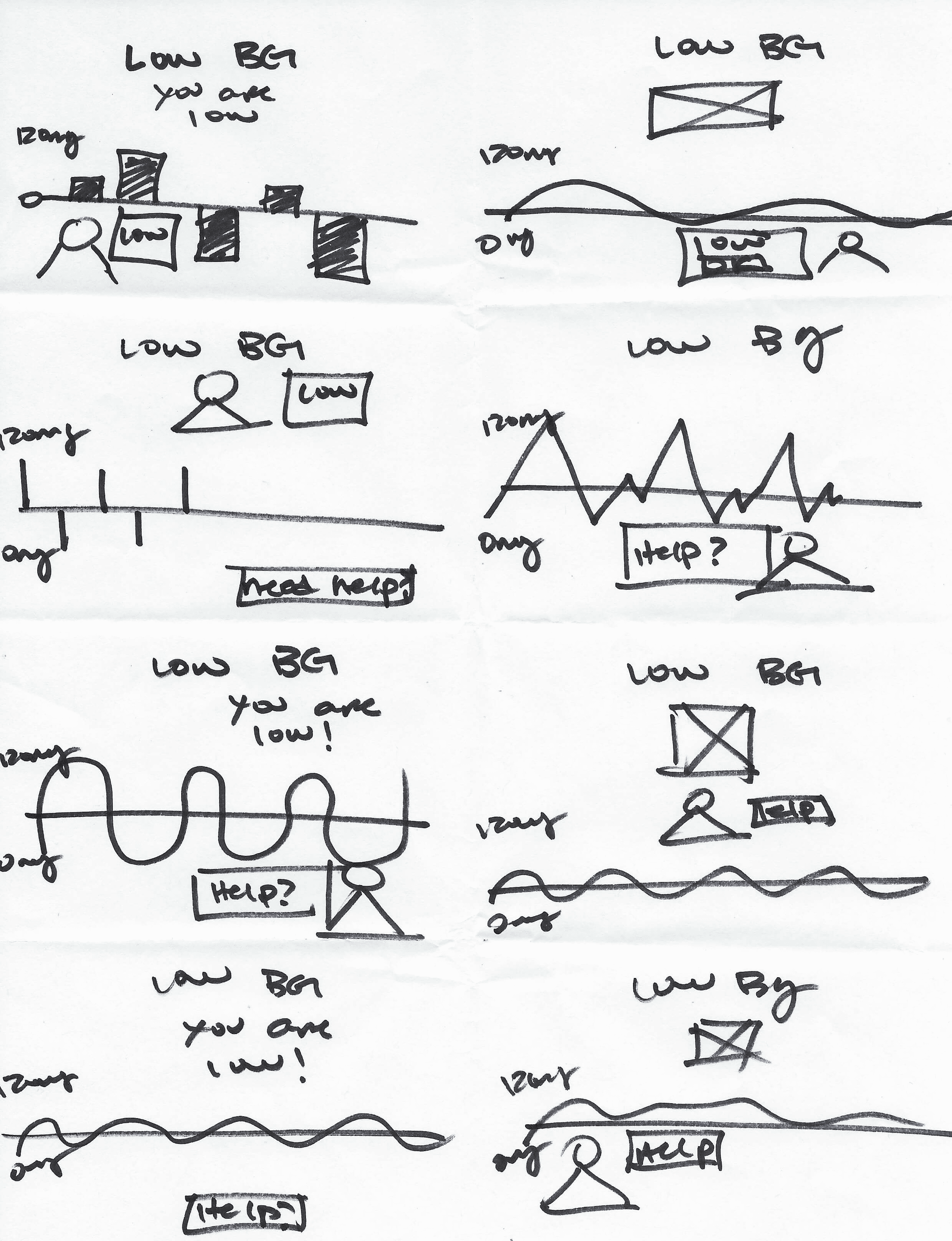
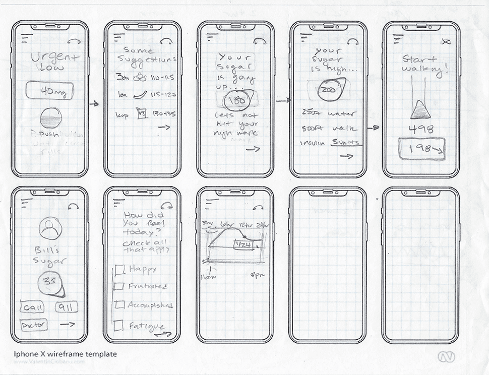
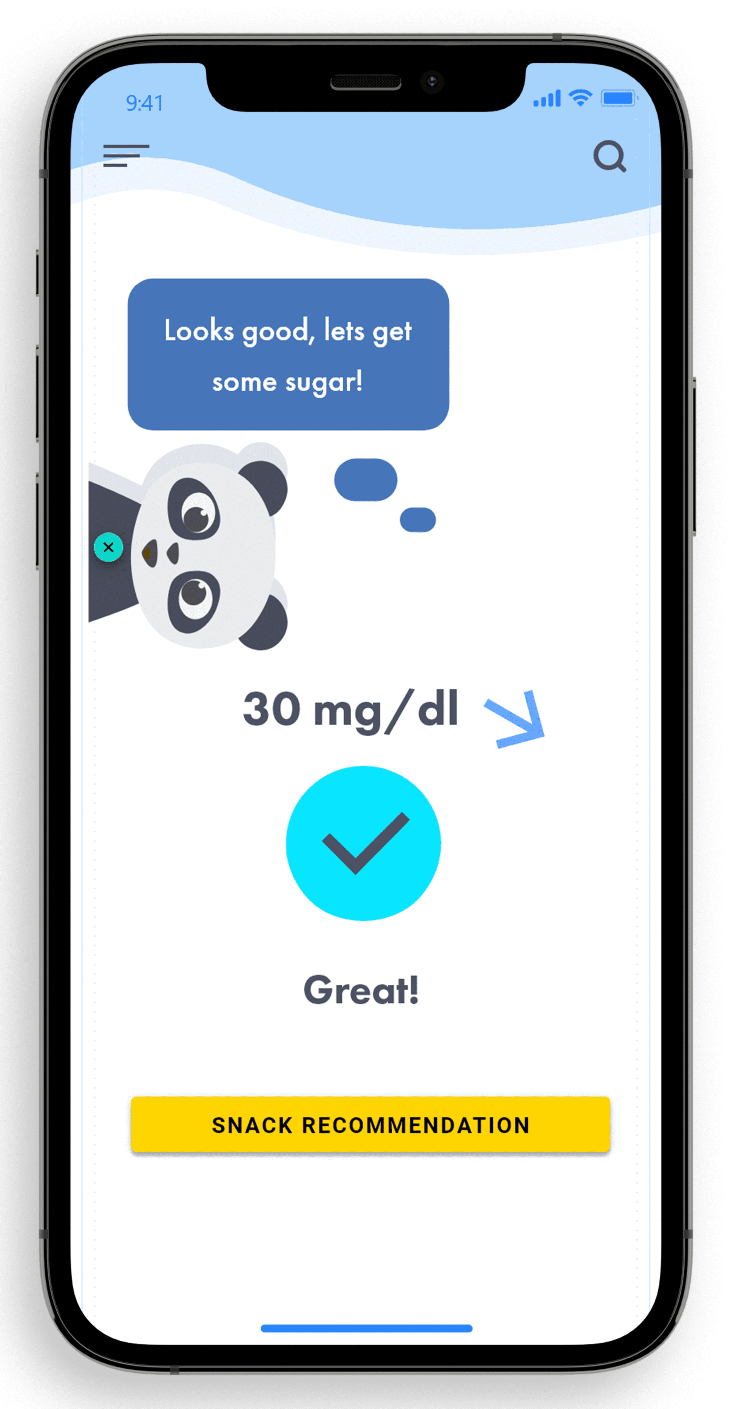
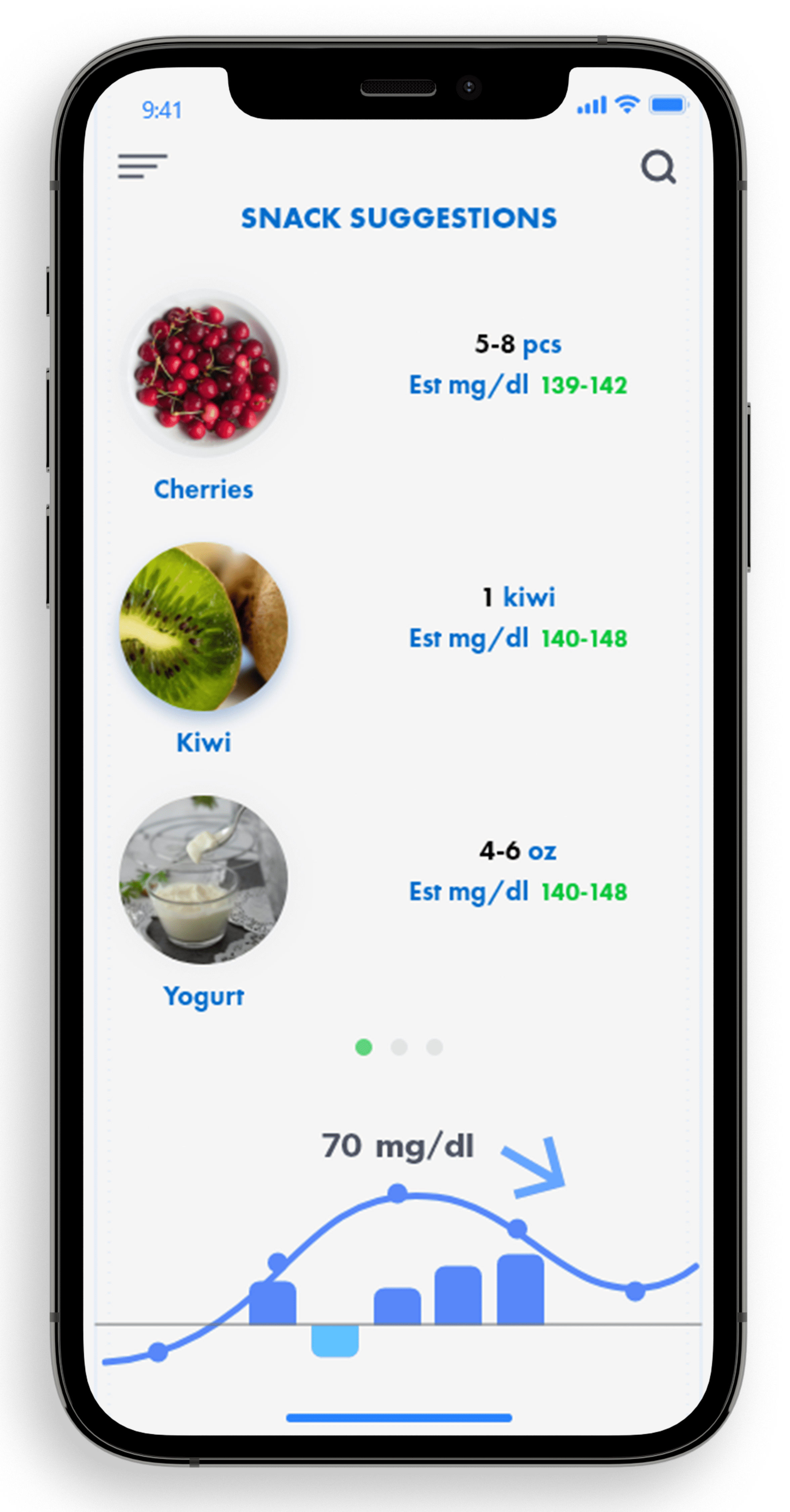
Low BG
Graphs-Graphs and key display of the patients blood sugar and given suggestions by their avatar.
Food-Food recommendations are suggested to raise blood sugar. This aesthetic of the application becomes the key of where the patient will provide their daily intake of insulin, food and emotional tracking record.
DiaTapp-When the patient gets too low, the app will ask the patient to tap on the DiaTapp feature. If patient is able to fill the circle the app suggests food to consume to help raise BG.
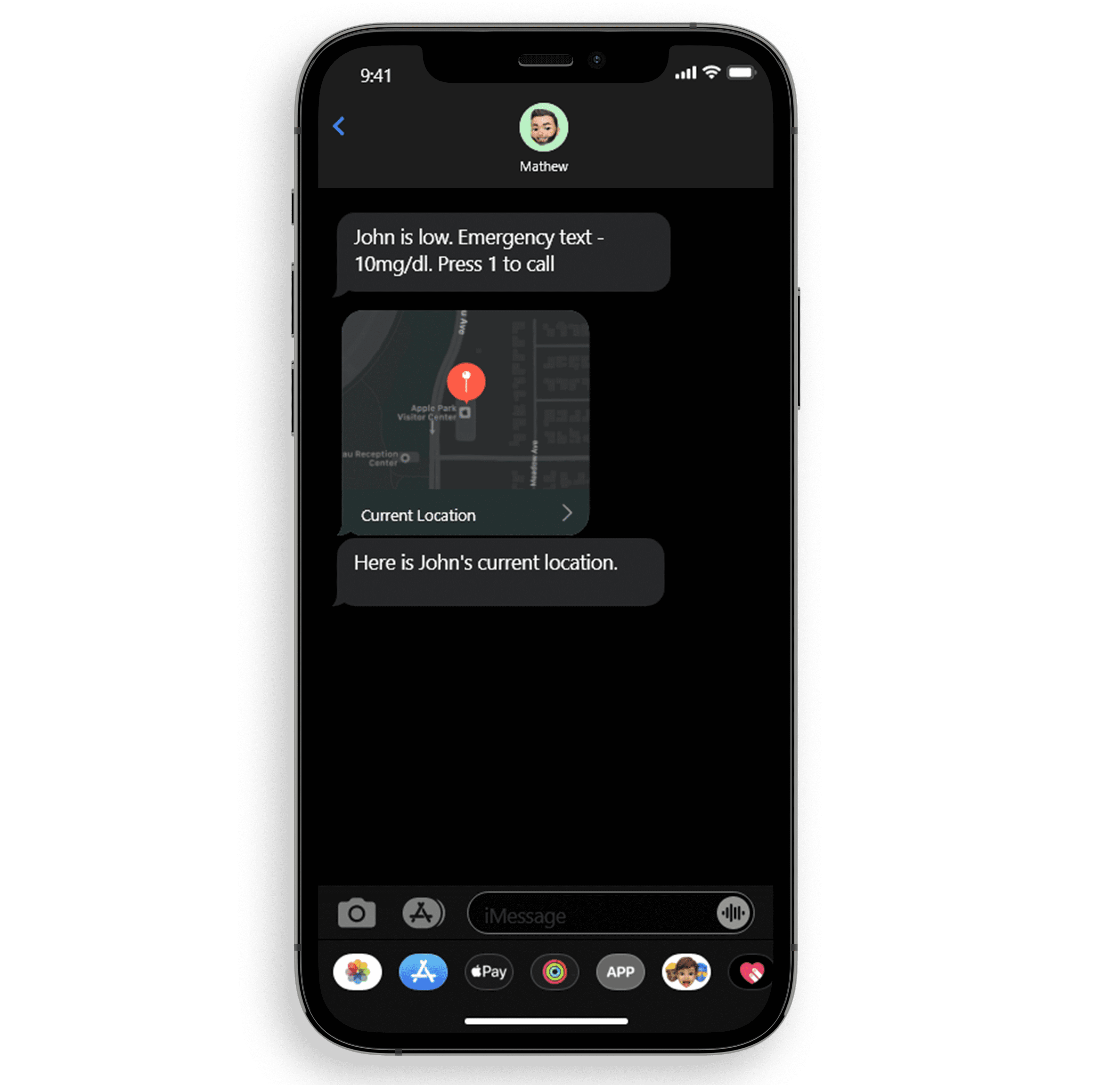
EMText-Auto emergency is initiated if the patient does not respond to their device. A location text and emergency call is sent to the connected emergency number that was provided in the settings.


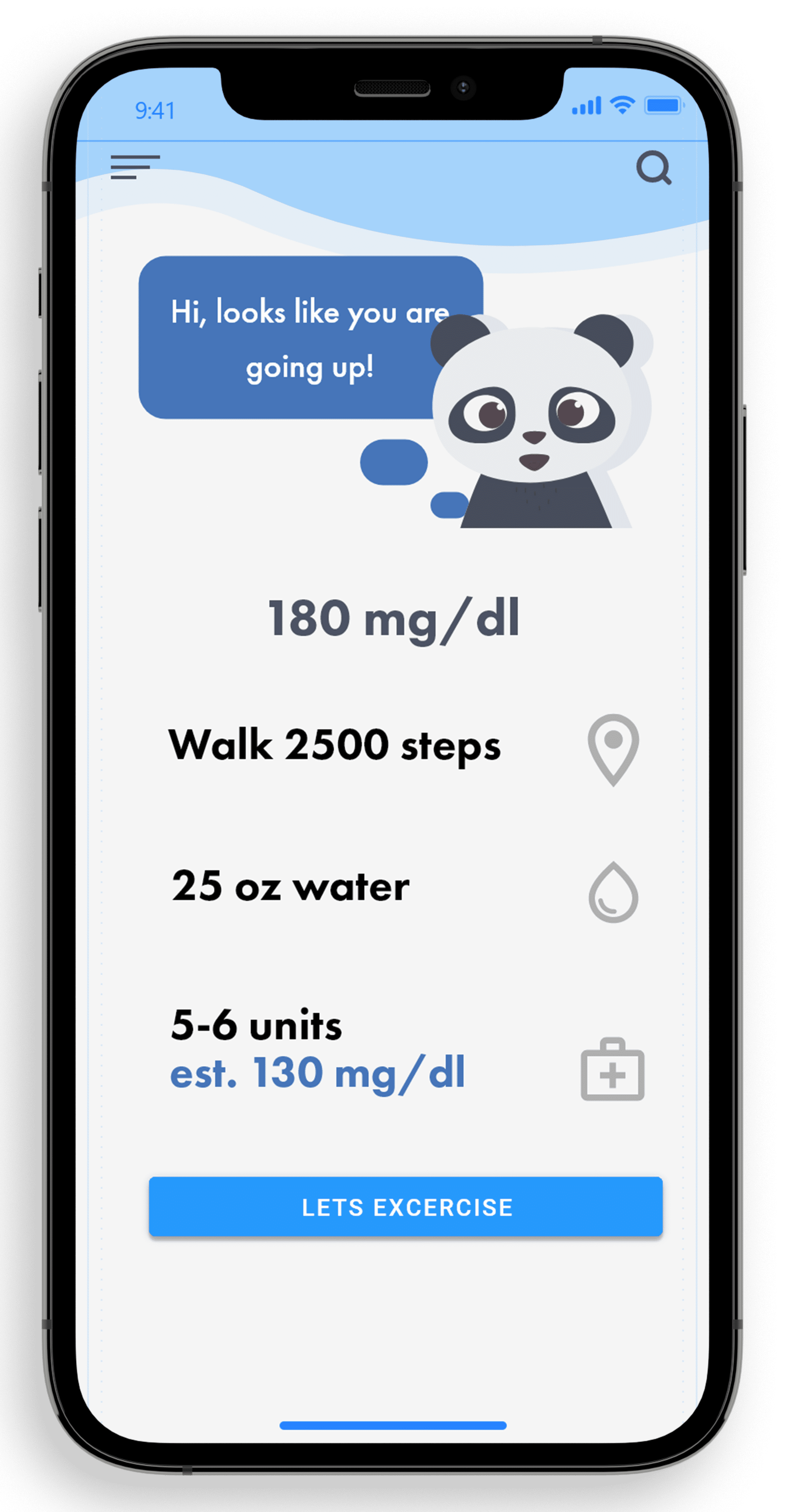
High BG
Notification-The app will ask the user if they would want help with maintaining their high blood sugar with a “Get Help” CTA.
Water Intake-We found that users become thirsty when experiencing a high BG, so the team suggested that the app recommends a certain amount of water to help with their numbers.
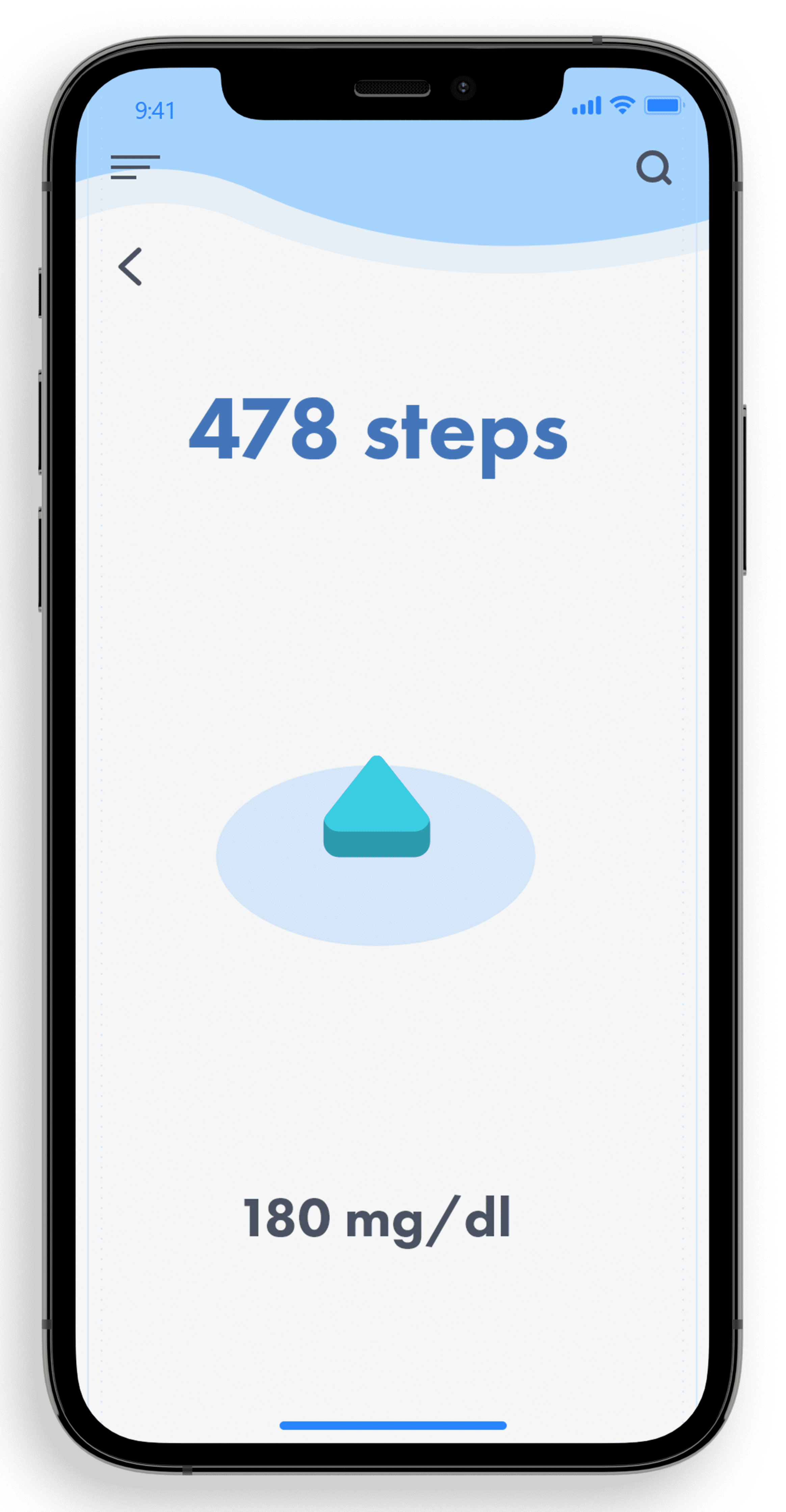
Steps to take-Our users also wanted to have an exercise involved when it came to their high BG, so we suggested that they receive an estimated step distance that could help lower their BG.
Brightmood
Mood-The mood chart is able to provide feedback on your daily trends from sadness to happiness. It keeps track of your progress increments of 24 hours, 1 week, 2 weeks and 30 days. The patient has the option to select their mood daily and helps keep track of their progress.
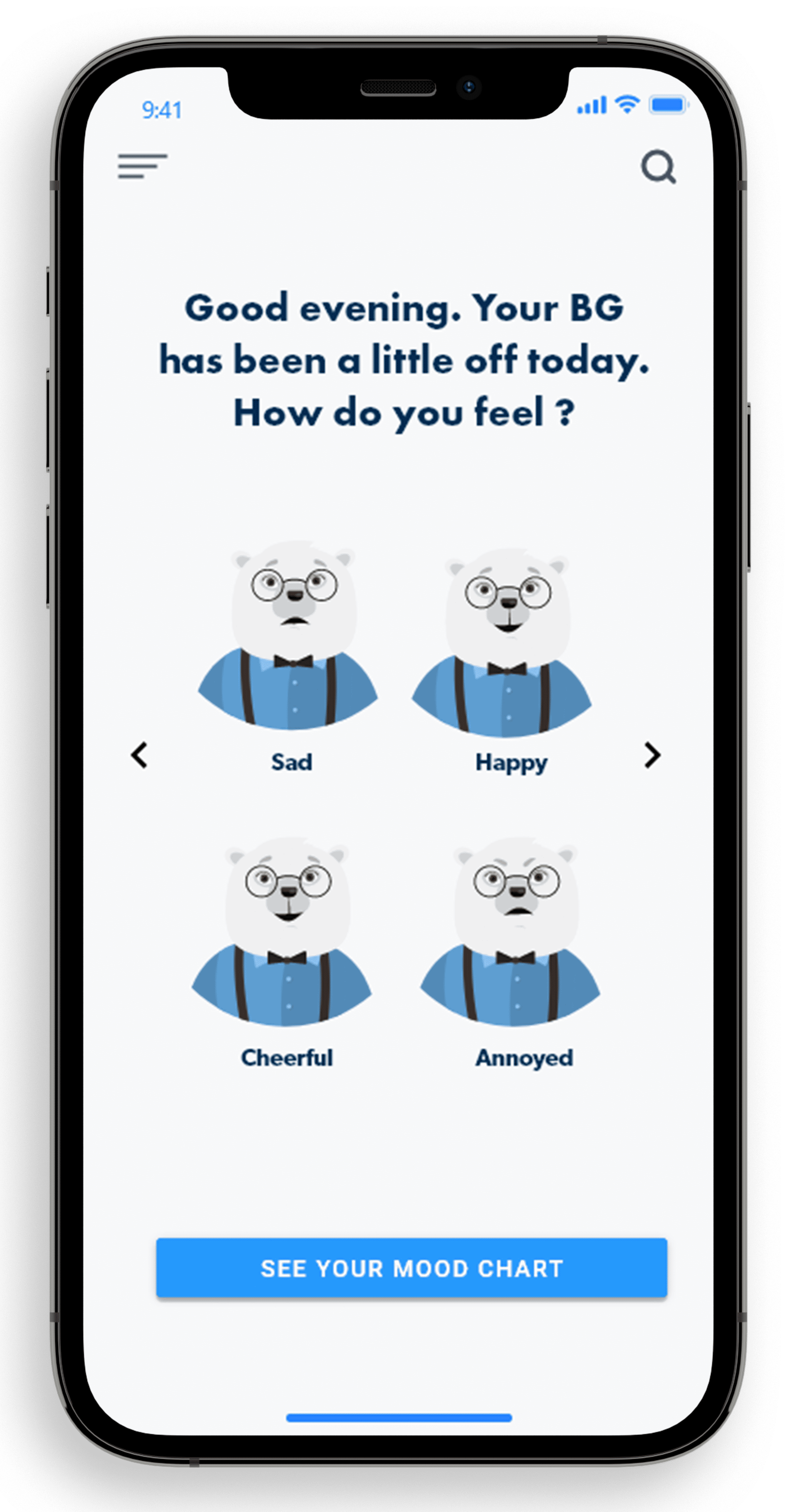
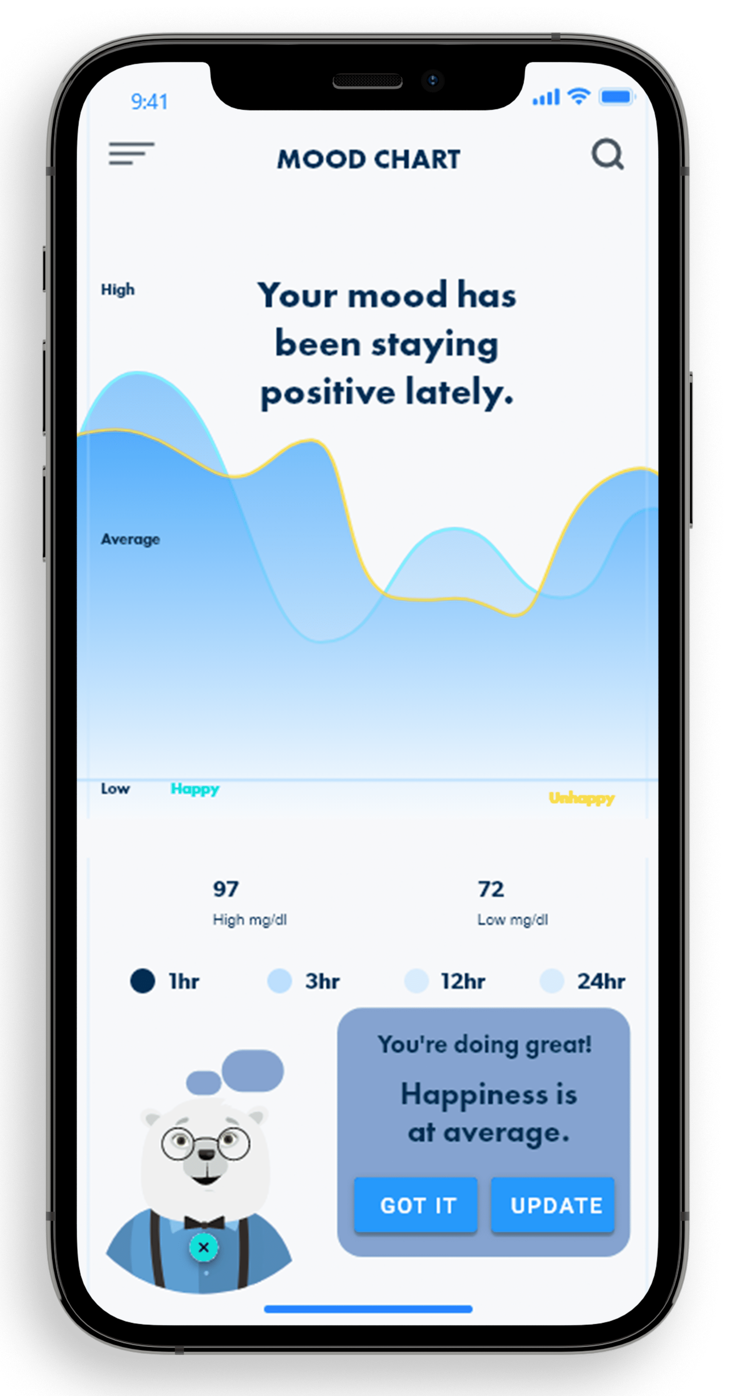
Motivation
Mood Checker-If progress of mood seems lower than average, a motivation section helps patients cope with their emotion with motivational speakers.
Testing
We decided to test remotely with the screeners through Zoom and Google Chat Since the prototype was built using Adobe XD, we examined each user on setting up their device and personalizing their settings, we looked for:
• The users navigation speed between screens (after giving them a few minutes with the application)
• Different use-cases: - Are they having a hard time inputting information - Were there too many options displayed - Can we make the settings easier to understand
Key Takeaways
1. I needed to empathize rather than sympathize
When we were testing the application with the users, I had thought that I covered everything they would need. I was proven wrong when they gave me their feedback.
2. No matter how you test, it cannot compare to real-world scenarios
I think it can explain all potential pain points during testing, but there are always improvements to be made. I knew that modifications were imminent, so I am pleased that it was ready.
3. The flowchart is the source of truth
Creating a flowchart gave me a better understanding of how to structure the solution. I pointed this out constantly throughout the project and it helped remind me what I need, why, and where it belongs in the process.